Revive
Overview
Revive is a blog focused on mental and physical health for the adult (and young adult) public, men and women. Their goal is to help people around the world live a life with more balance and awareness about their health. They offer their users online yoga classes and orientation about their quality of life. Their articles include a range of subjects about well-being, teaching their users breathing techniques, how to cope with anxiety and other emotions, and tips on how to eat more healthily. In 2022, they decided to create their own app so they could get closer to their users and offer them more specific content based on their choices of subjects.
My job here was to make this happen, creating a new friendly interface for their blog and app, and applying the best choices for their product usability.
Micro-interactions
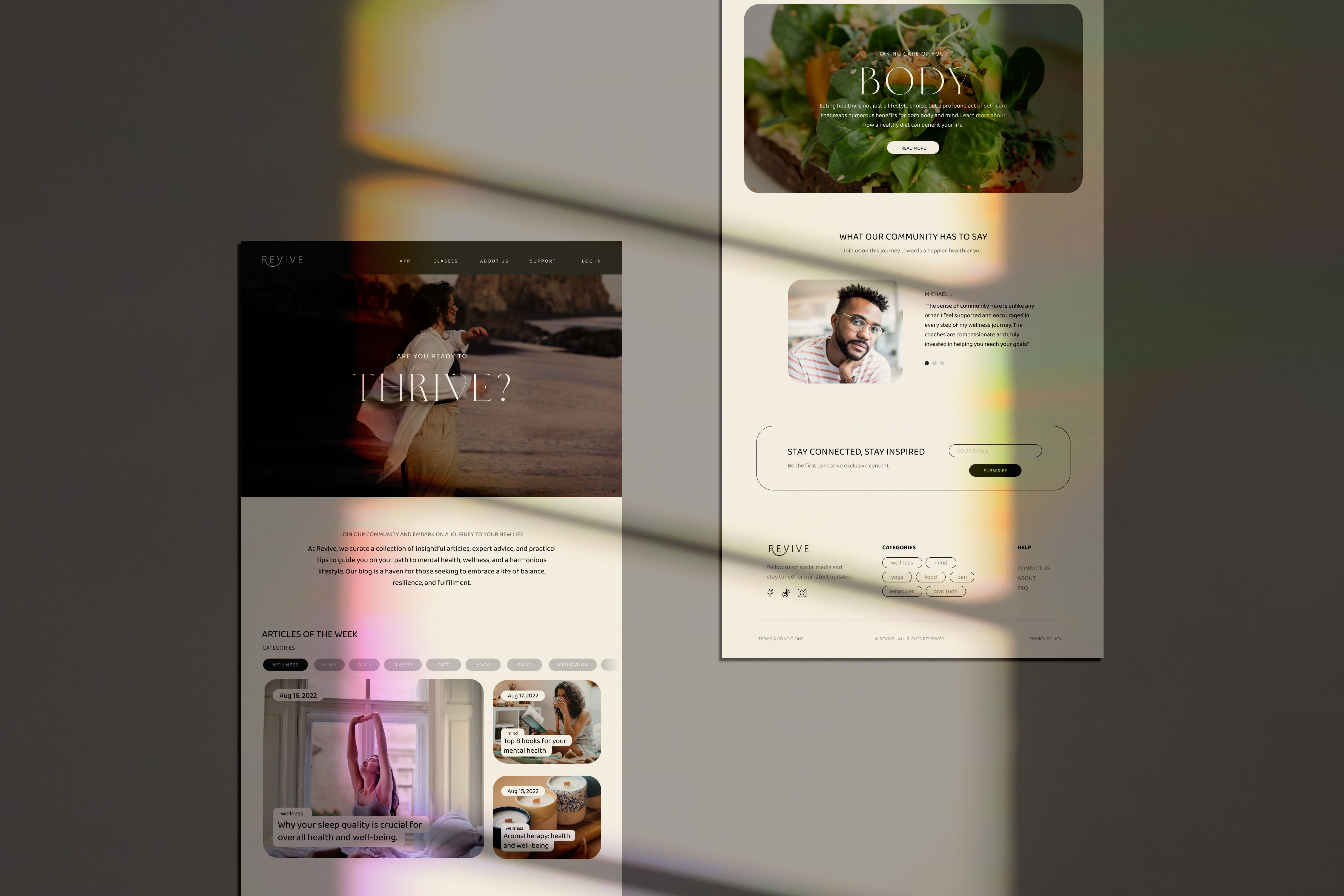
Creating a new blog from scratch was a fun experience for me. As a blog reader myself, I feel overwhelmed with so much information we face when we open a page. I wanted to make it as simple as possible, including micro-interactions, a clean interface, an organized information hierarchy, and a functional website.
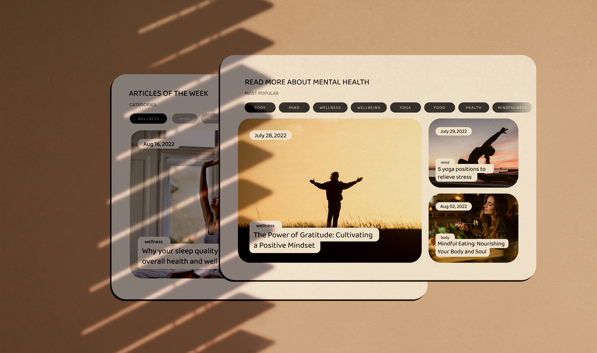
The ease of searching for a determined subject is important to help the users locate themselves with articles they are more interested in. This is one of the main goals of functionality to the users. Creating a friendly and clean atmosphere is a priority when working with so much data.
Empathy
The choices I had along the way helped to understand the priorities when designing for a vast group of people. The rounded tips of the images create a more friendly environment, along with the fonts, the buttons, copyrighting, and colors. The mobile version of the blog helps the users feel more at home by following the same parameters as the desktop version. When facing a different interface from different devices, this could cause confusion and make them quit using the platform.
The App
The complexity of this project wasn't my biggest concern, but being my first time developing an app with a group of designers was another challenge to explore. The goal of the app was to bring the community together, making them feel more close to their team of professionals. The unique aspect of this client was the ability to bring all of their content to a downloadable platform where you can access a diversity of content based on their recommendations of the algorithm and have your appointments with your coach wherever you are.
Home Page
The choice of neutral colors not only serves the purpose of a clean design but also creates a more comfortable space, especially coming from a community focused on well-being. The users can log in to their accounts and access their appointments to their next classes, which is possible on both devices (mobile or desktop). The preference for the app when dealing with appointments increased by almost 80%, making the website a better choice for reading and checking their schedules for the next class. Every section of the home page has a purpose to deliver the information they need without having to look for it, making good use of content and space.

Social Media Presence
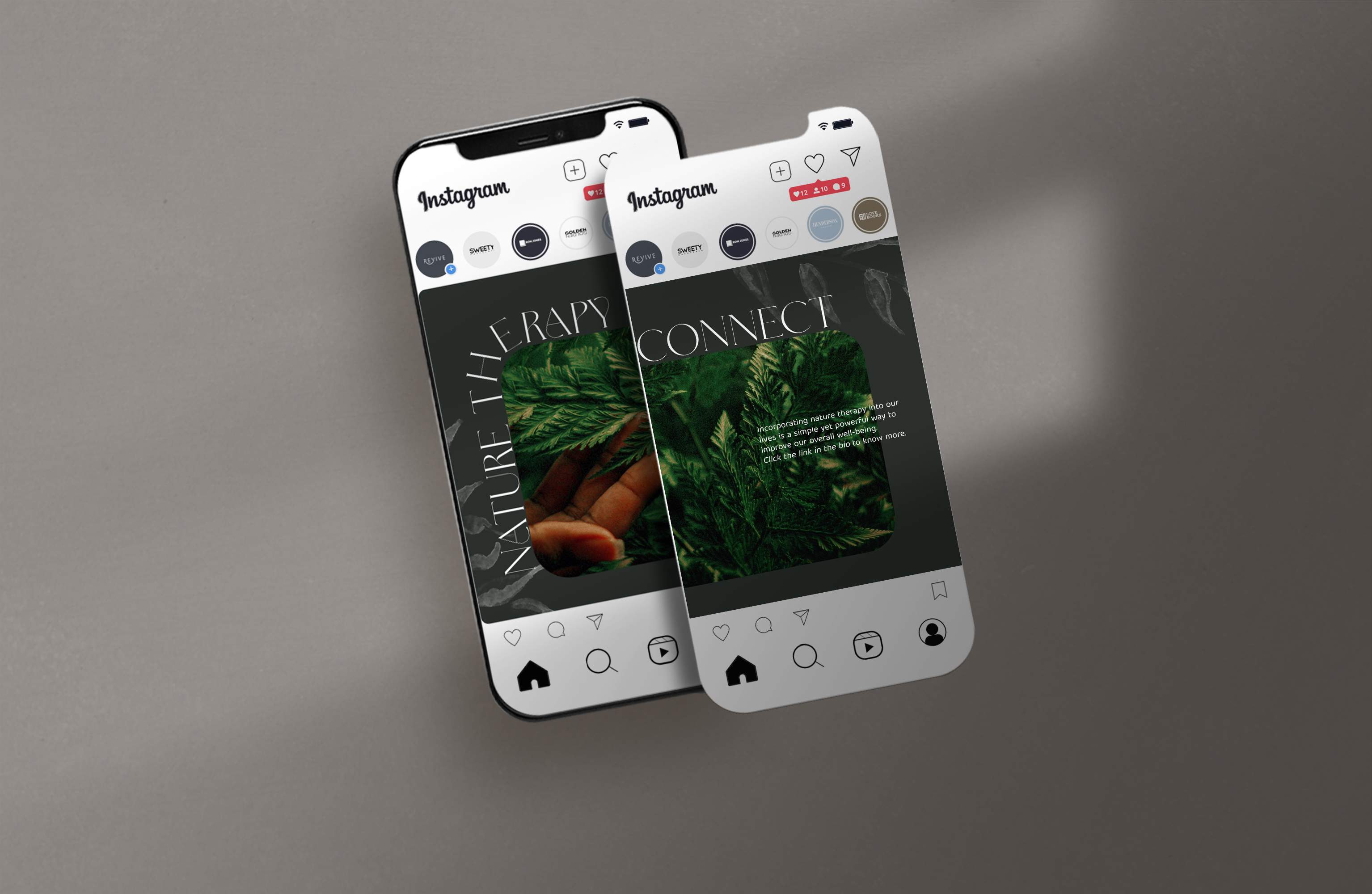
Last but not least, I was also responsible for their social media content, making examples of templates for their content on Instagram. The following examples follow the same style as the website; a clean and consistent direction of design.
— Conclusion
Everyone talks about the best parts of working on projects like these, but only a few talk about the struggles a designer and a client have to go through to make it work. The stages of interviewing the users to prototyping can be challenging when working with a small team of designers on a website/app with so much data, making the final result feel more rewarding in the end. I want to thank Revive for putting their trust in me and my 3 other coworkers (Giovanna Silva, Eric Isidore, and Lucas Andreas) for creating this amazing experience.


