Colorae
Overview
Colorae is a paint brand that believes color is more than what you see on a wall — it’s the beginning of a story shaped by moments, people, and places. Each shade holds a memory, a feeling, a reflection of where you’ve been — or where you’re going next.
My mission was to bring life to an idea that began as a sketch on paper. I developed the brand’s visual identity and supported its growth through marketing and creative strategy — building concepts grounded in our mission and aligned with target goals. Through competitor research and market analysis, we translated those ideas into campaigns that connected meaning with design.

Brand's Mission
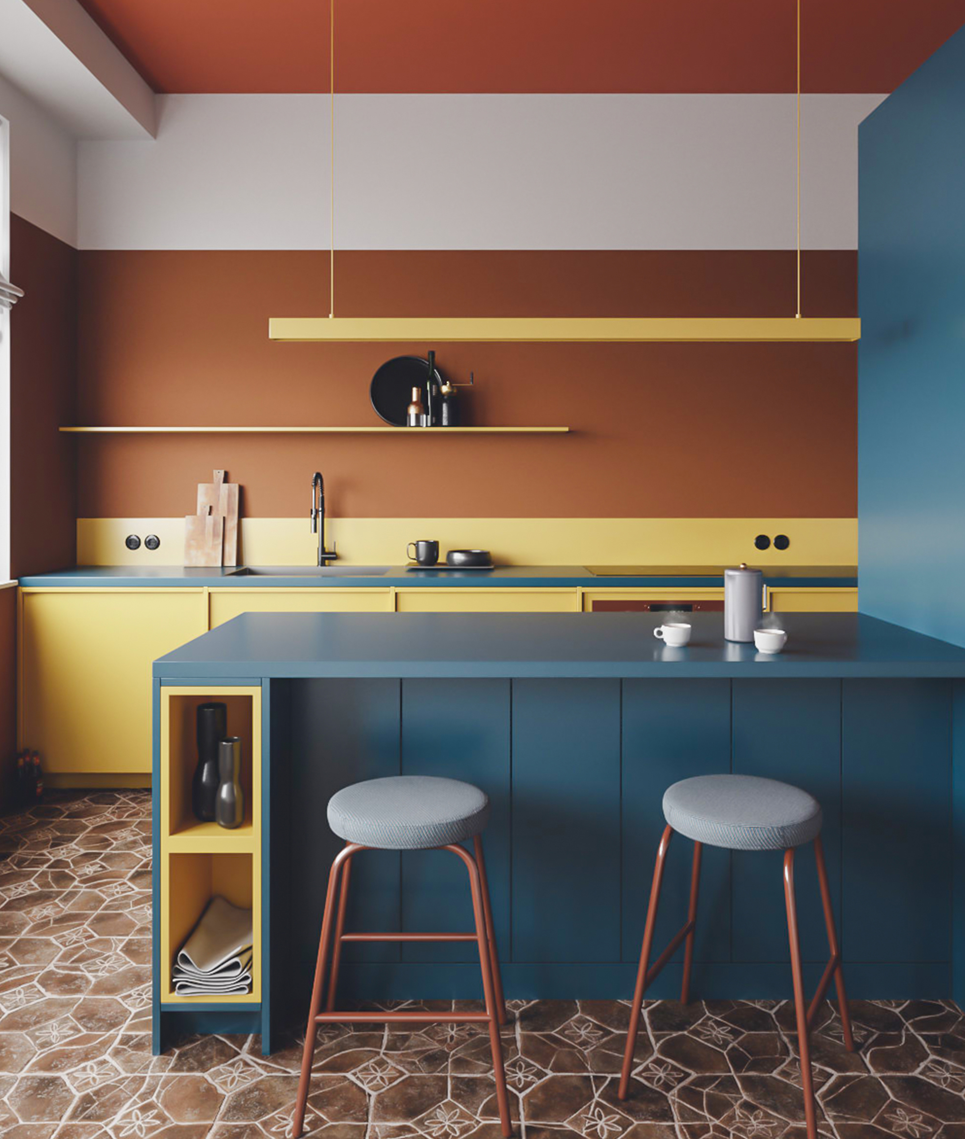
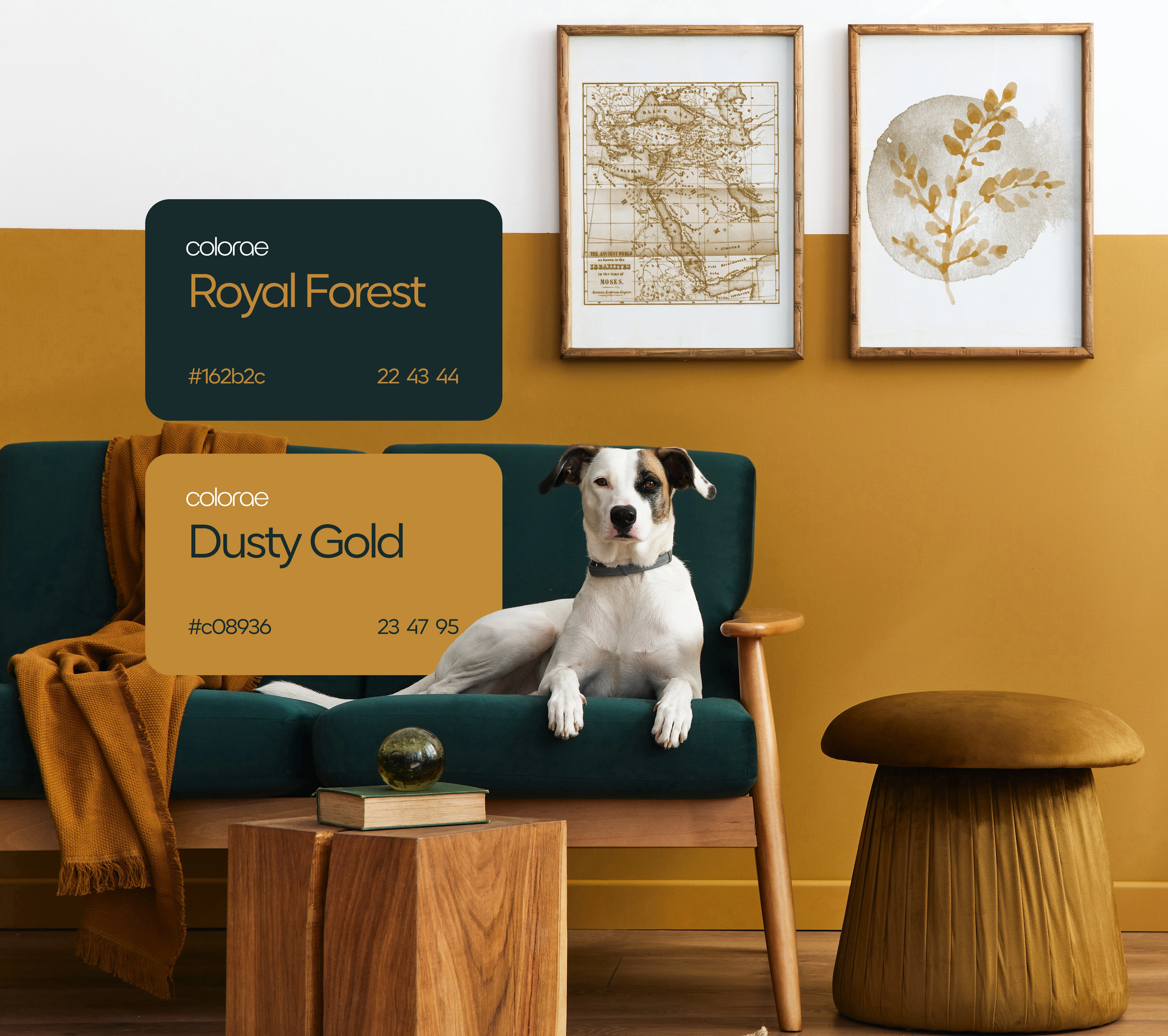
Colorae’s mission is to help people create meaningful spaces, celebrating every memory as its own. Colorae designs each tone with intention, inviting you to connect with your surroundings in ways that feel personal and lasting.
my choices
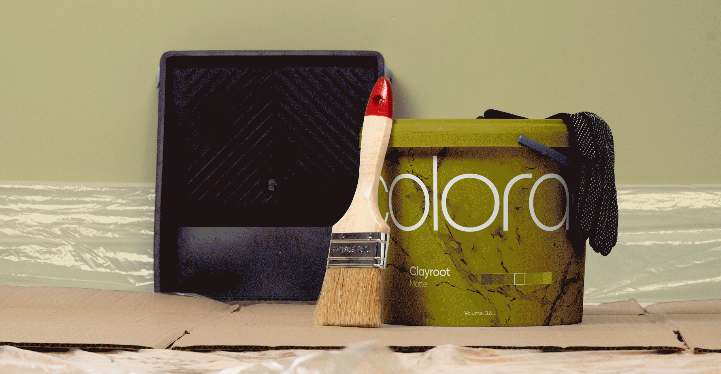
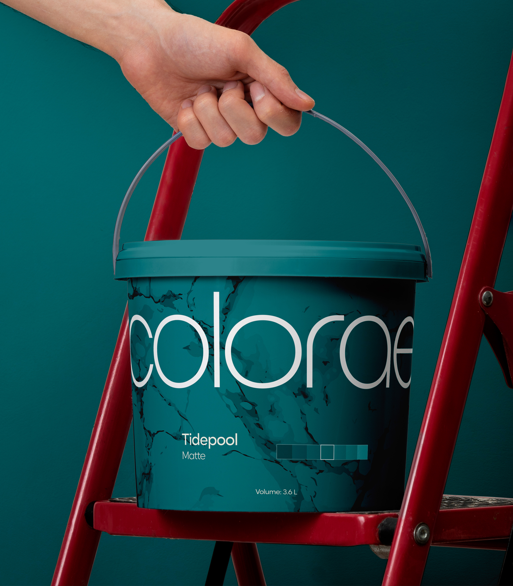
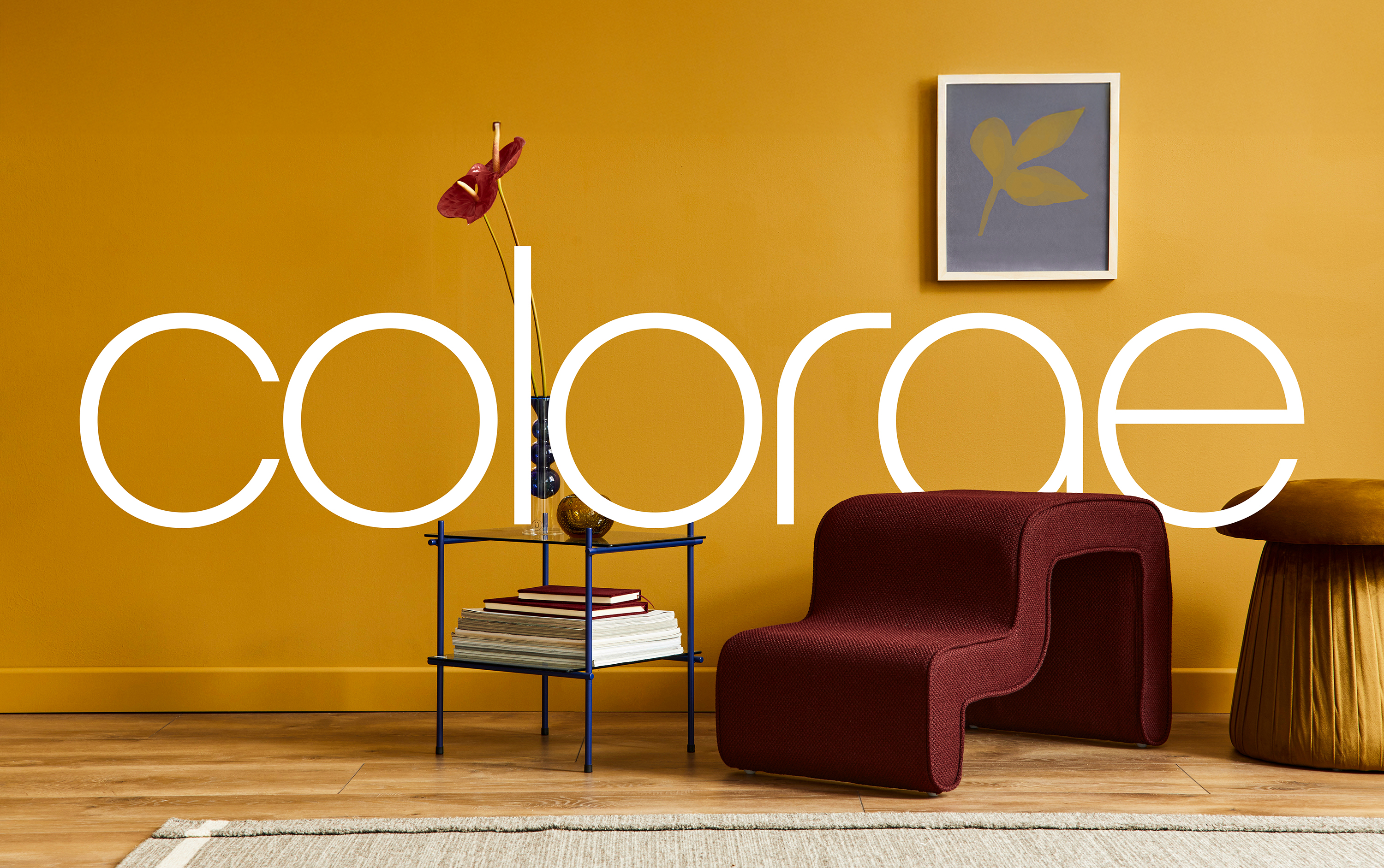
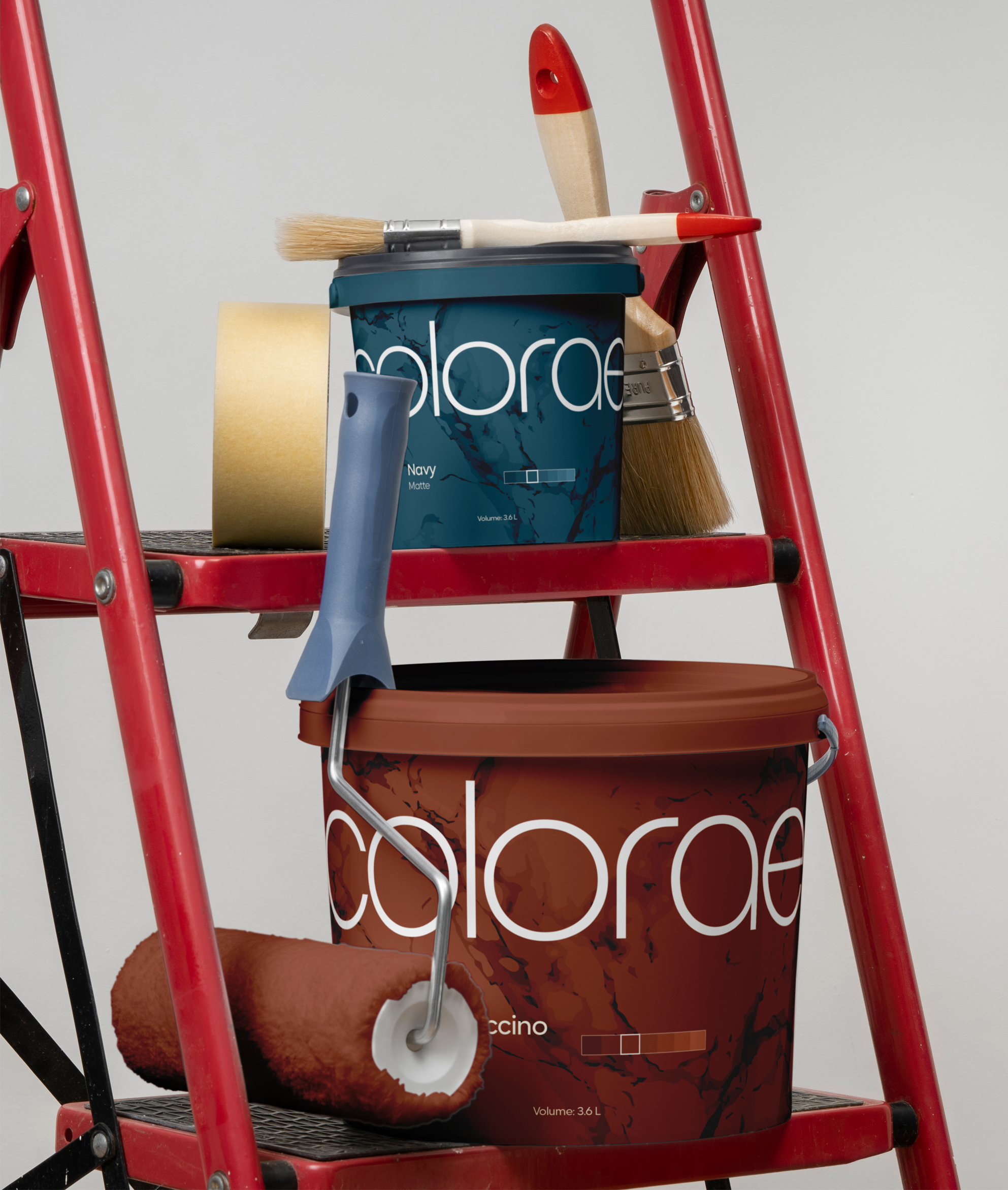
Minimal design doesn’t mean the absence of feeling; it means that emotion is delivered through subtlety, quality, and intention. Typography and layout choices were made to create consistency and trust. The system is built to feel usable, accessible, and quietly confident — a brand that supports people in their everyday lives without overwhelming them.
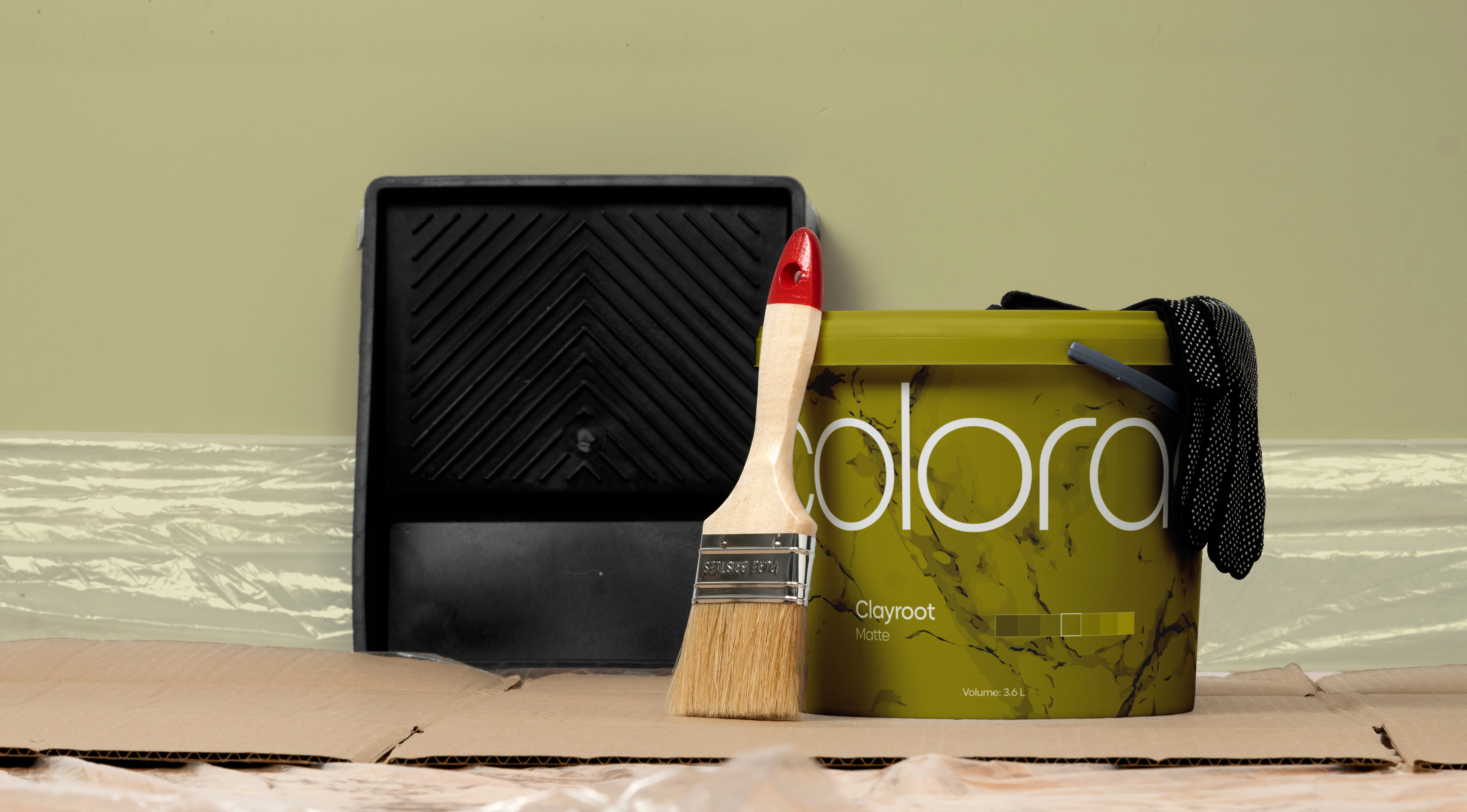
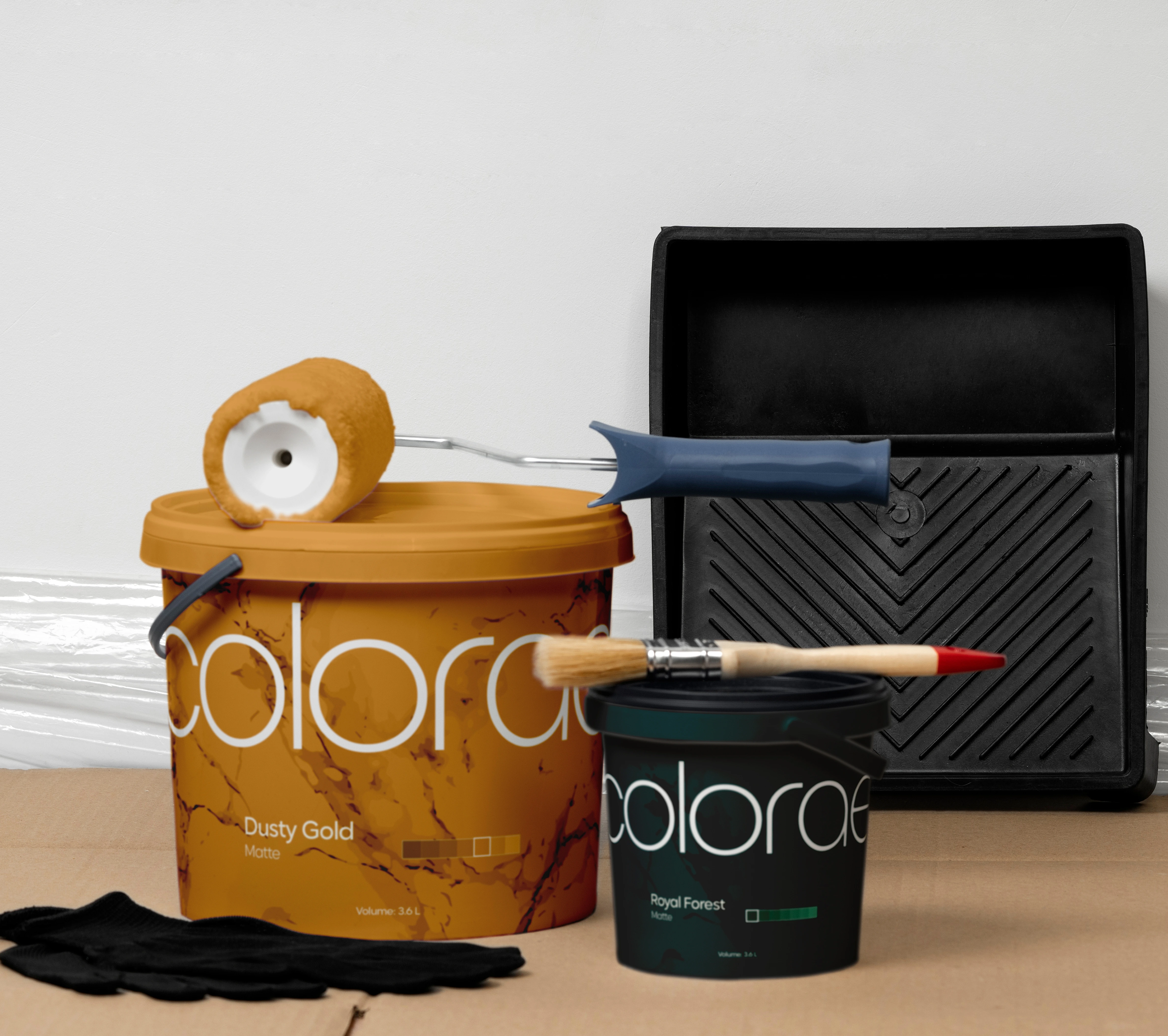
Colorae is not childish or naive, even though it embraces the playfulness of color. It’s a modern, grounded brand made for adults who value comfort and meaning. Every choice, from color system to packaging, supports this foundation: a minimal yet emotive brand, designed to make space for what truly matters — the stories people paint into their homes.
Strategy & Solutions
The challenge was to transform an early idea into a brand system that felt intentional, memorable, and aligned with its mission. This included building a flexible visual language, defining tone and messaging, and developing campaign concepts grounded in research and aligned with our target audience.
The result is a cohesive brand system that reflects Colorae’s mission and gives the team the tools and resources to communicate with their audience with meaning and intention.
Research & Discovery
Colorae’s visual identity was shaped by both strategy and empathy. Through competitor research, we noticed that most paint brands lean into minimalism — not as an aesthetic choice, but as a functional one. For Colorae, minimalism became more than a style; it became a reflection of our mission.
The design is clean, but never cold. Every element — from typography to layout — was chosen to express reliability, and presence.