Cora

Overview
Specializing in organic skin care products, Cora is a beacon of authenticity that offers natural solutions for all skin types. Their commitment goes beyond skin-deep. They represent an eco-conscious movement, striving to reduce toxic products for both your skin and the environment. Cora encapsulates the essence of natural beauty and an eco-conscious mindset. My job here was to bring this value to their visual identity, creating a logo along with packaging concepts.
Cora believes that the path to radiant skin lies in harmony with nature, and their brand is a testament to the transformative power of organic skincare.


Concept
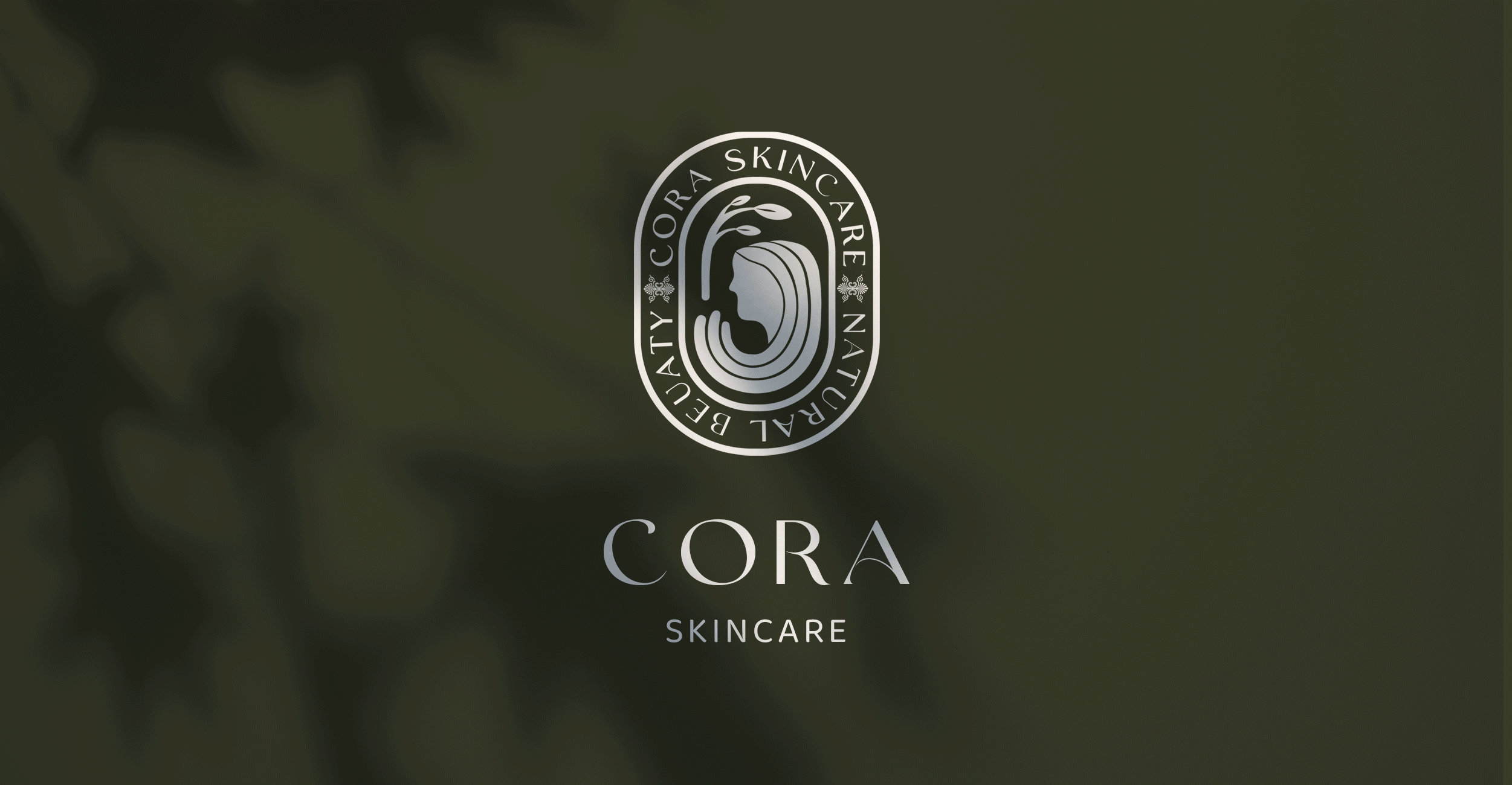
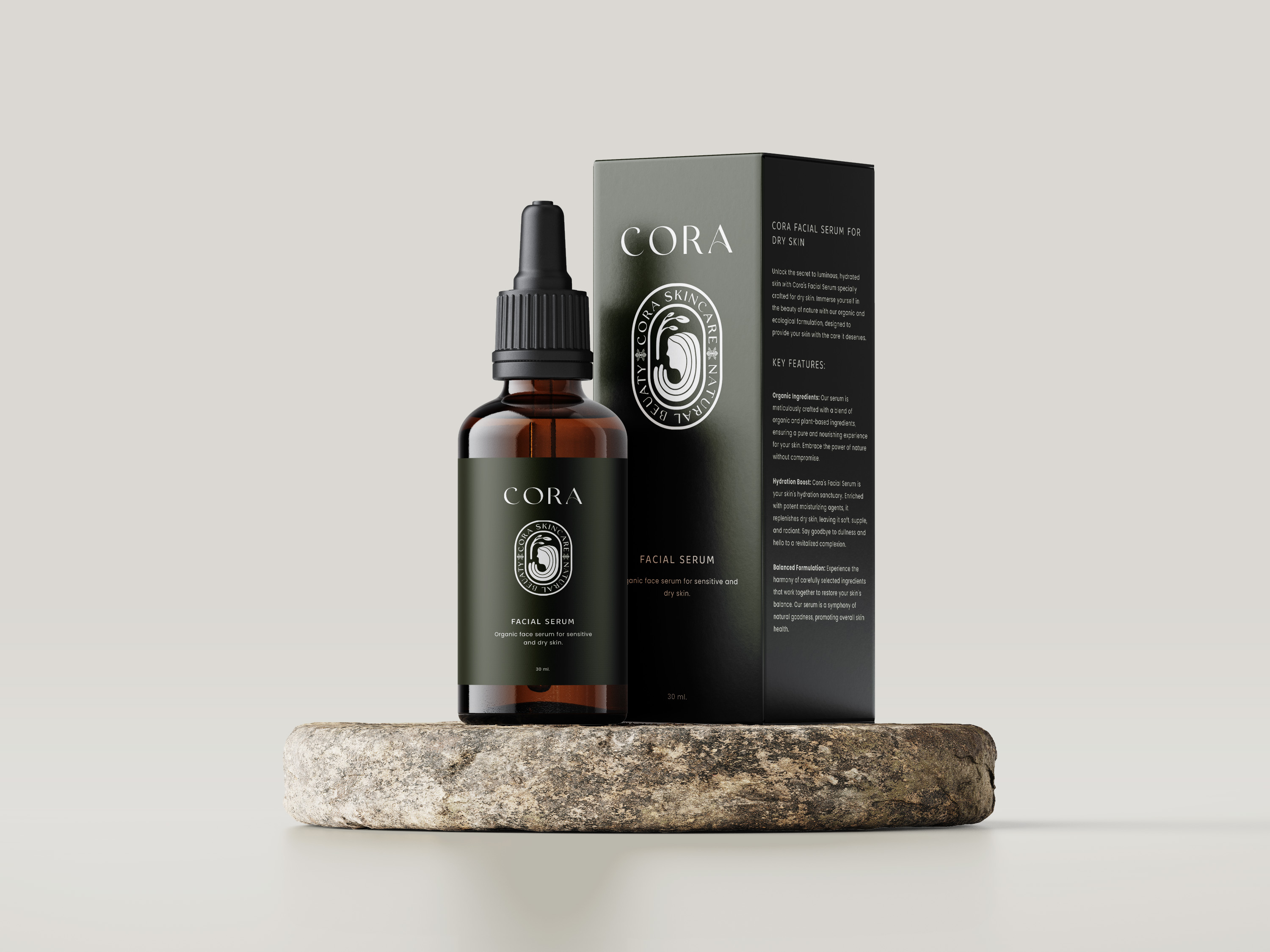
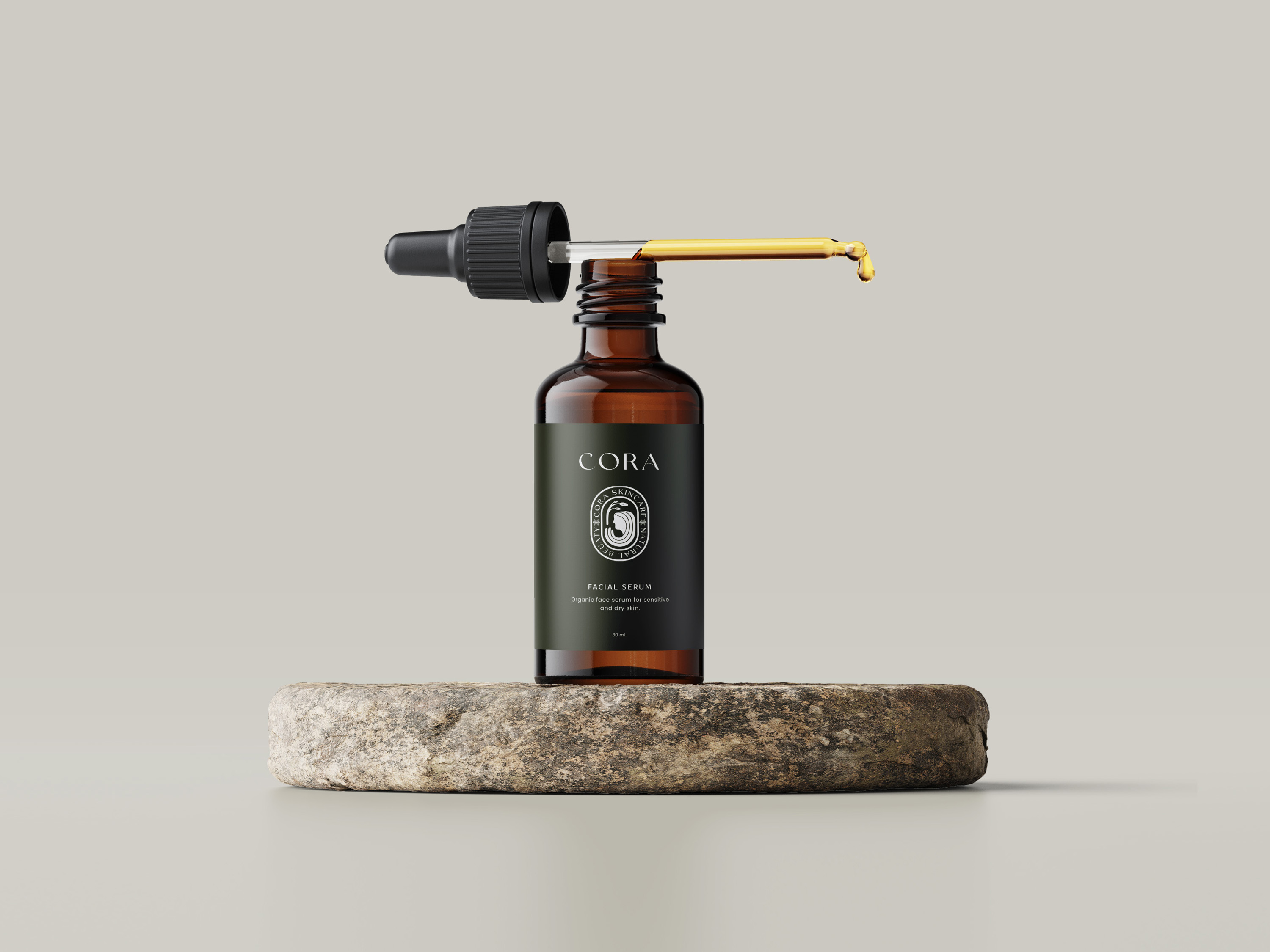
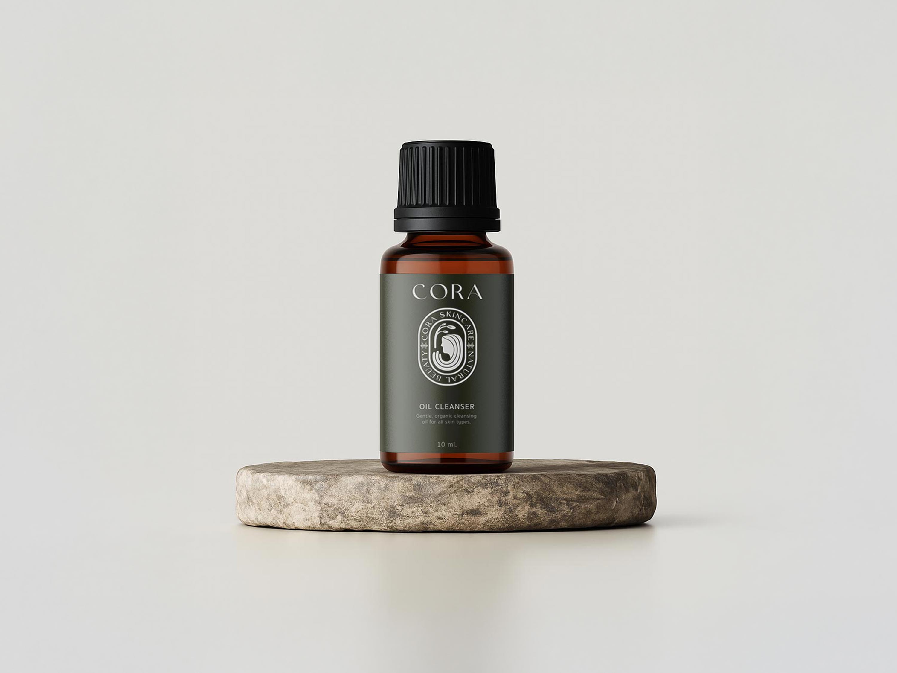
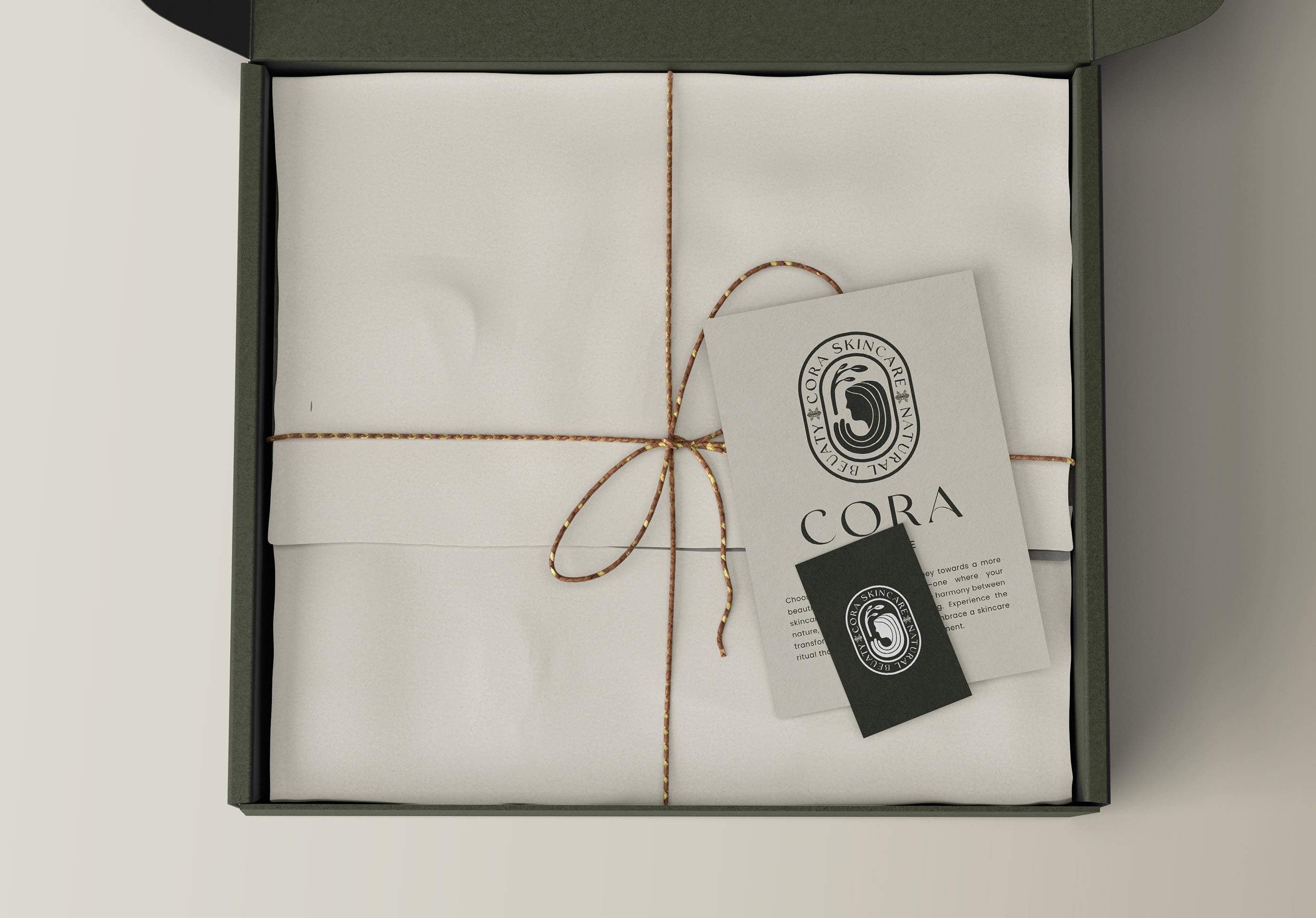
Earthy tones, recyclable materials, and minimalistic yet elegant designs create a seamless blend of nature-inspired aesthetics and functionality. The Greek-inspired logo not only captures the essence of Mother Earth but also signifies the brand's timeless commitment to authenticity. The packaging concept, with its eco-friendly elements, reflects Cora's dedication to reducing environmental impact, ensuring that every product contributes to a cleaner and healthier planet.

Deep Dive
Cora stands as a testament to the possibility of achieving healthier skin without compromise. Their products are ethically sourced, cruelty-free, and free from harmful chemicals. In every design choice, my primary focus was to align Cora's visual language with its core values of authenticity, inclusivity, and education, contributing to a healthier planet by minimizing our ecological footprint and advocating for a cleaner beauty industry.

"Revitalize,
Rejuvenate,
Radiate"

