Olea
Overview
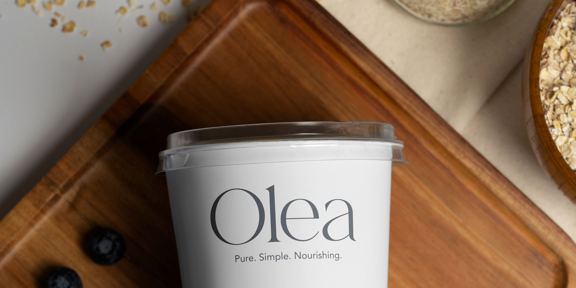
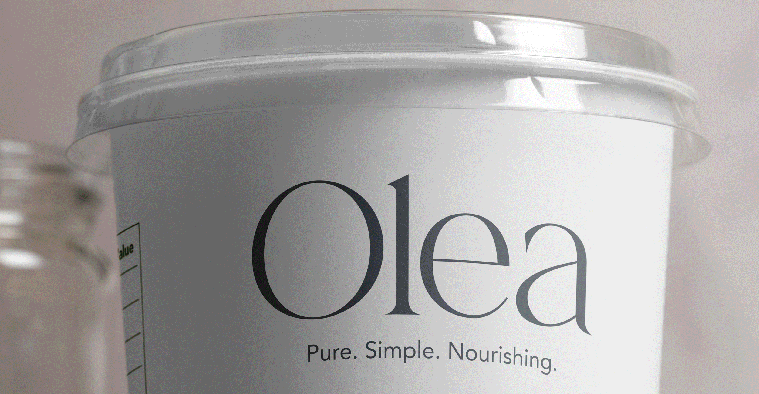
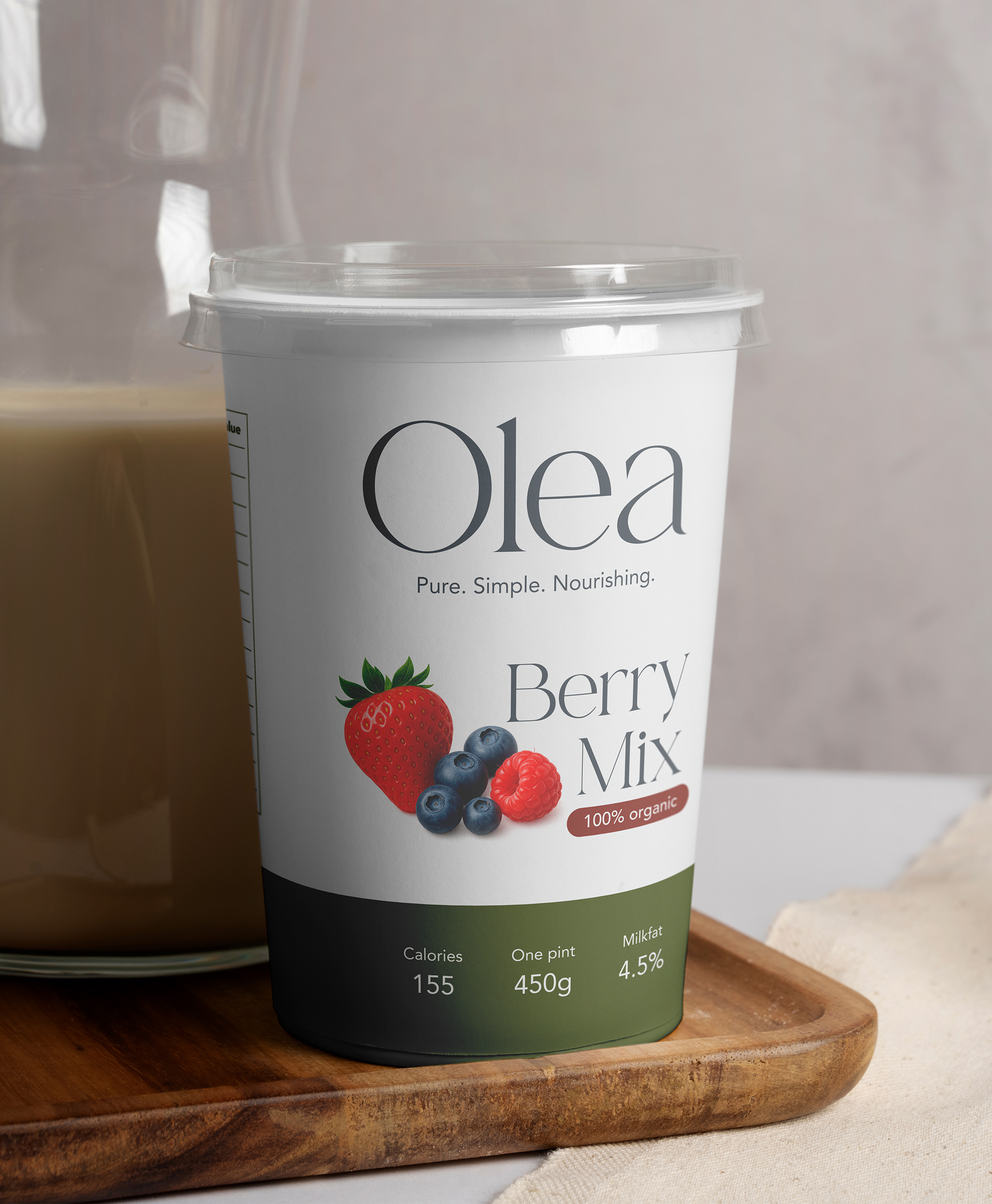
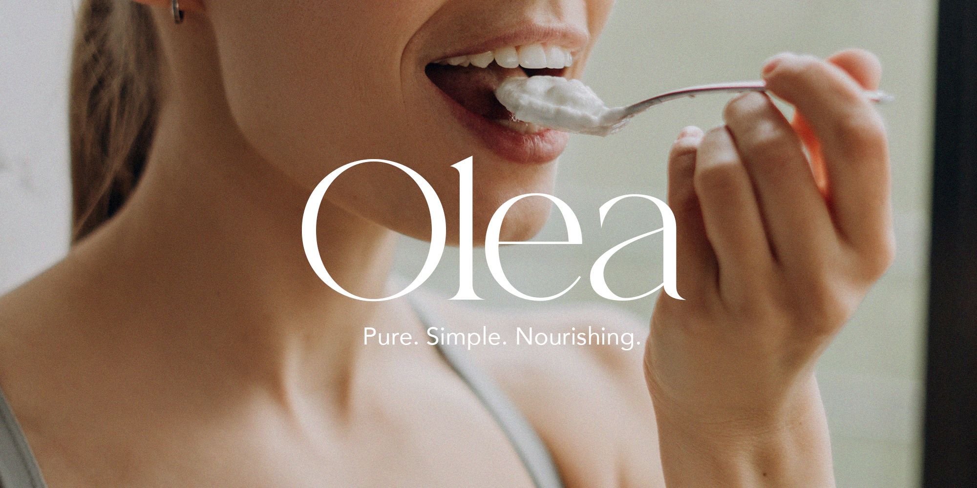
Olea is a modern yogurt brand inspired by the Mediterranean approach to life: balanced, honest, and fresh. The brand celebrates simple nutrition and the connection between natural ingredients and mindful living. I developed the full visual identity for Olea, including the logo design, color palette, typography system, packaging design, and brand voice. I also created supporting marketing materials such as print ads and billboard concepts to visualize the brand in real-life contexts.
The Brand
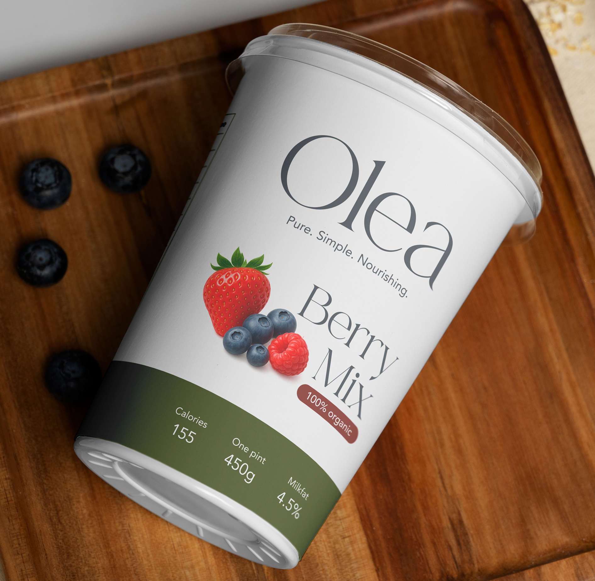
Olea comes from the Latin word for olive; a symbol of longevity and nourishment, values that perfectly reflect what the Olea brand stands for. The goal was to create a brand that feels grounded, minimal, and modern, while still carrying a sense of warmth and authenticity.
The design had to balance health and indulgence, showing that good-for-you products can be beautiful, simple, and desirable. While we consider nutrition important and essential, the idea behind Olea is not to create an overly ‘healthy’ or clinical brand, but one that feels nourishing and minimal.
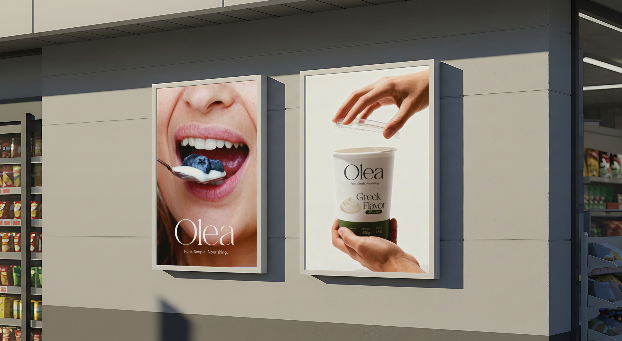
Marketing
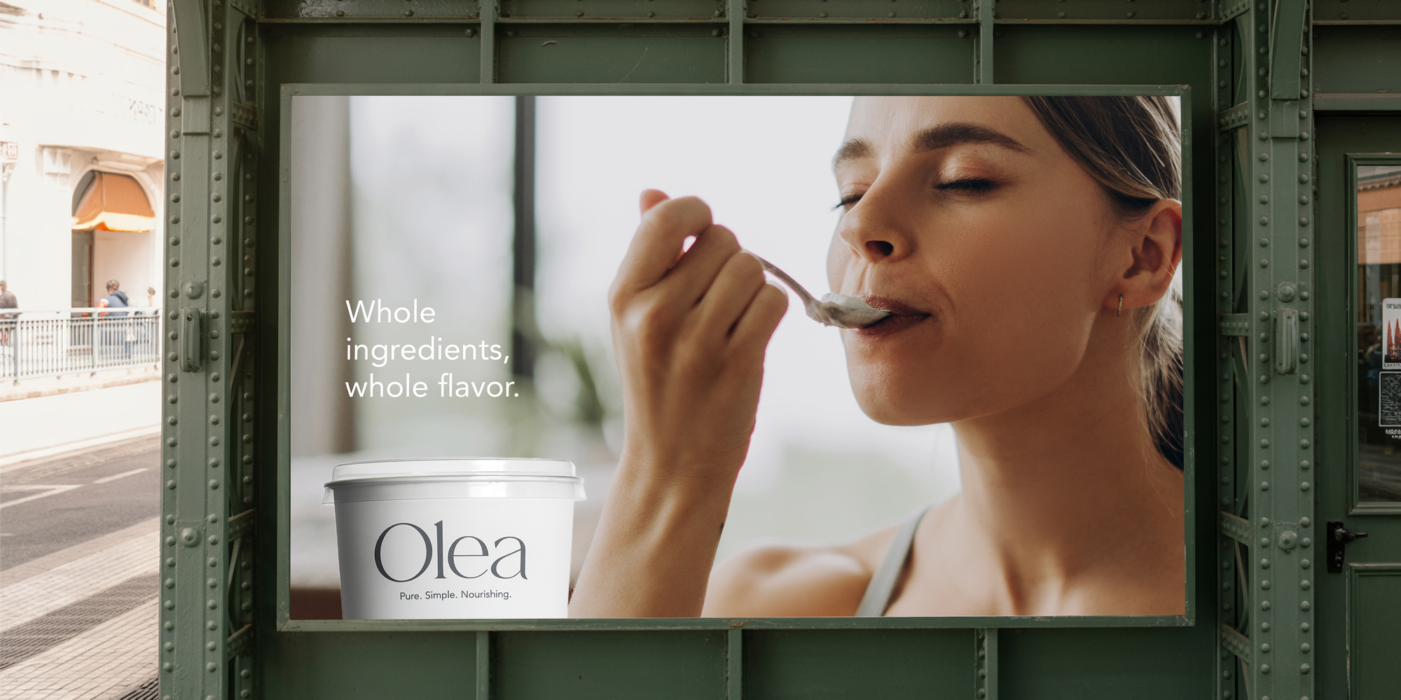
The marketing approach for Olea focuses on simplicity and lifestyle, rather than heavy messaging. Olea taggline “Pure. Simple. Nourishing.” were created to reinforce the brand’s personality — confident, modern, and clear.
Concept
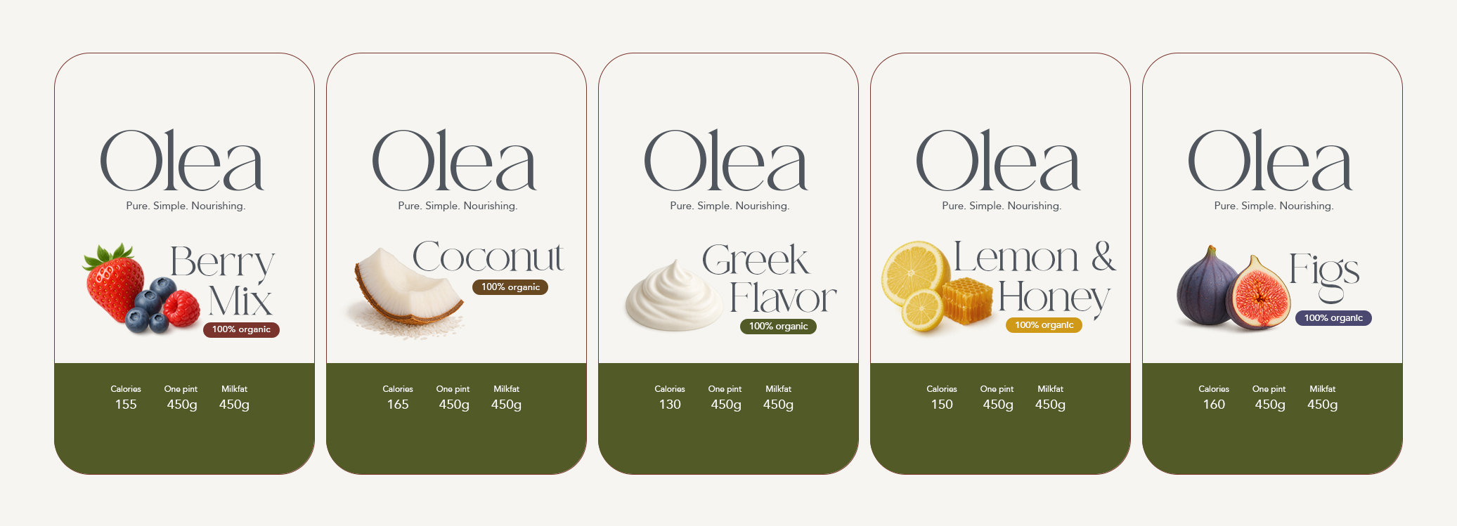
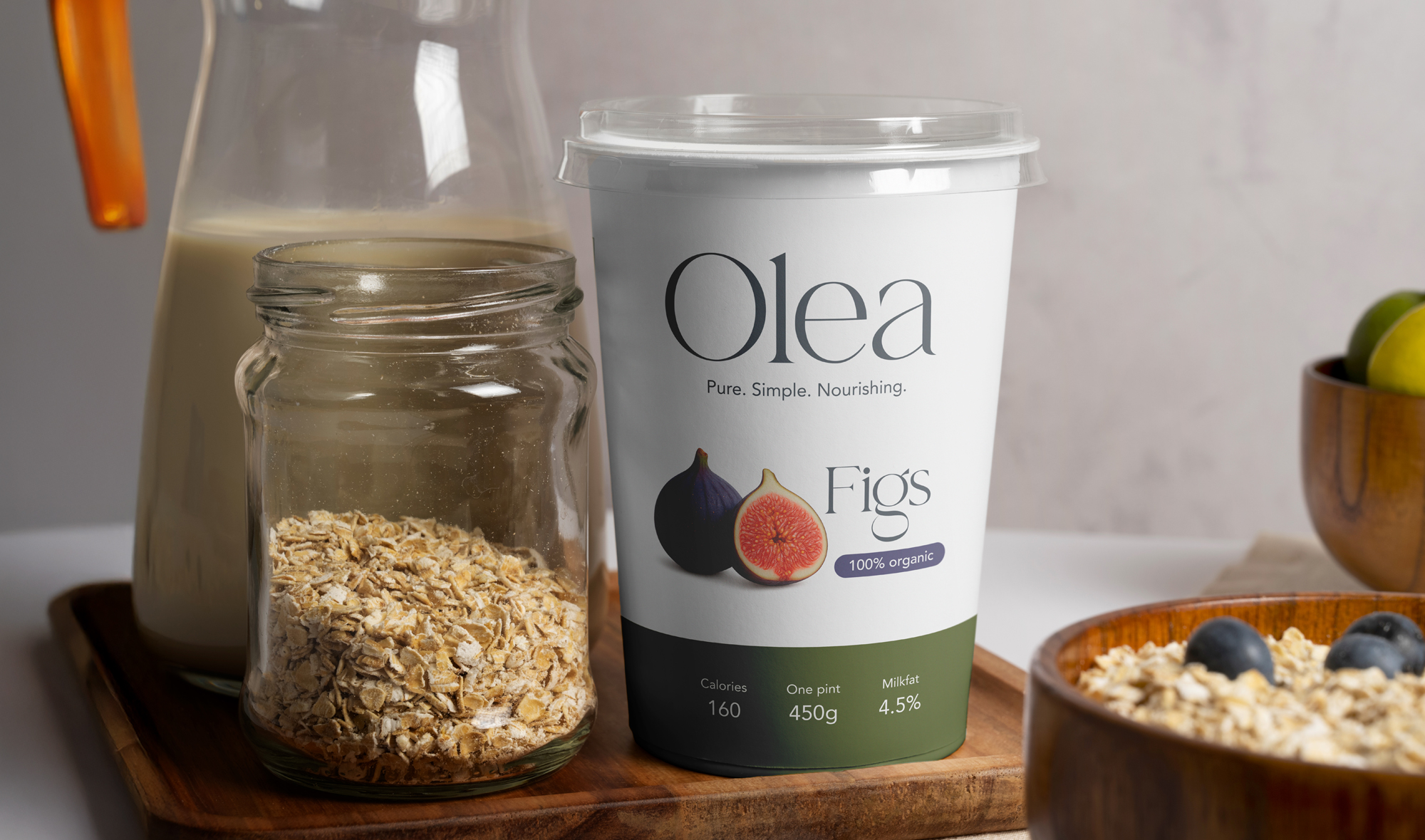
Transparent fruit images add natural appeal while the cream base color maintains brand unity. The result is a design that feels refreshing, modern, and honest — exactly how Olea should be experienced. Olea taught me how to communicate purity and warmth without heavy design, and how thoughtful details — color, typography, composition — can bring authenticity to a brand’s story.