Colorae
Overview
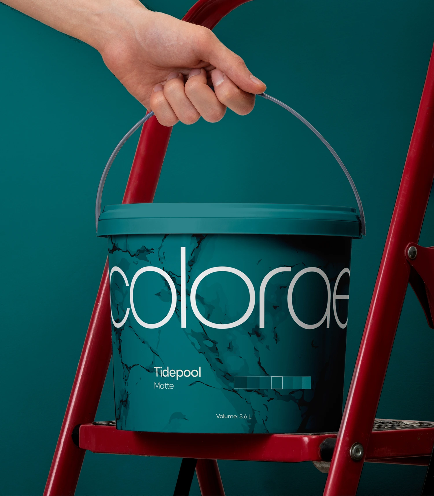
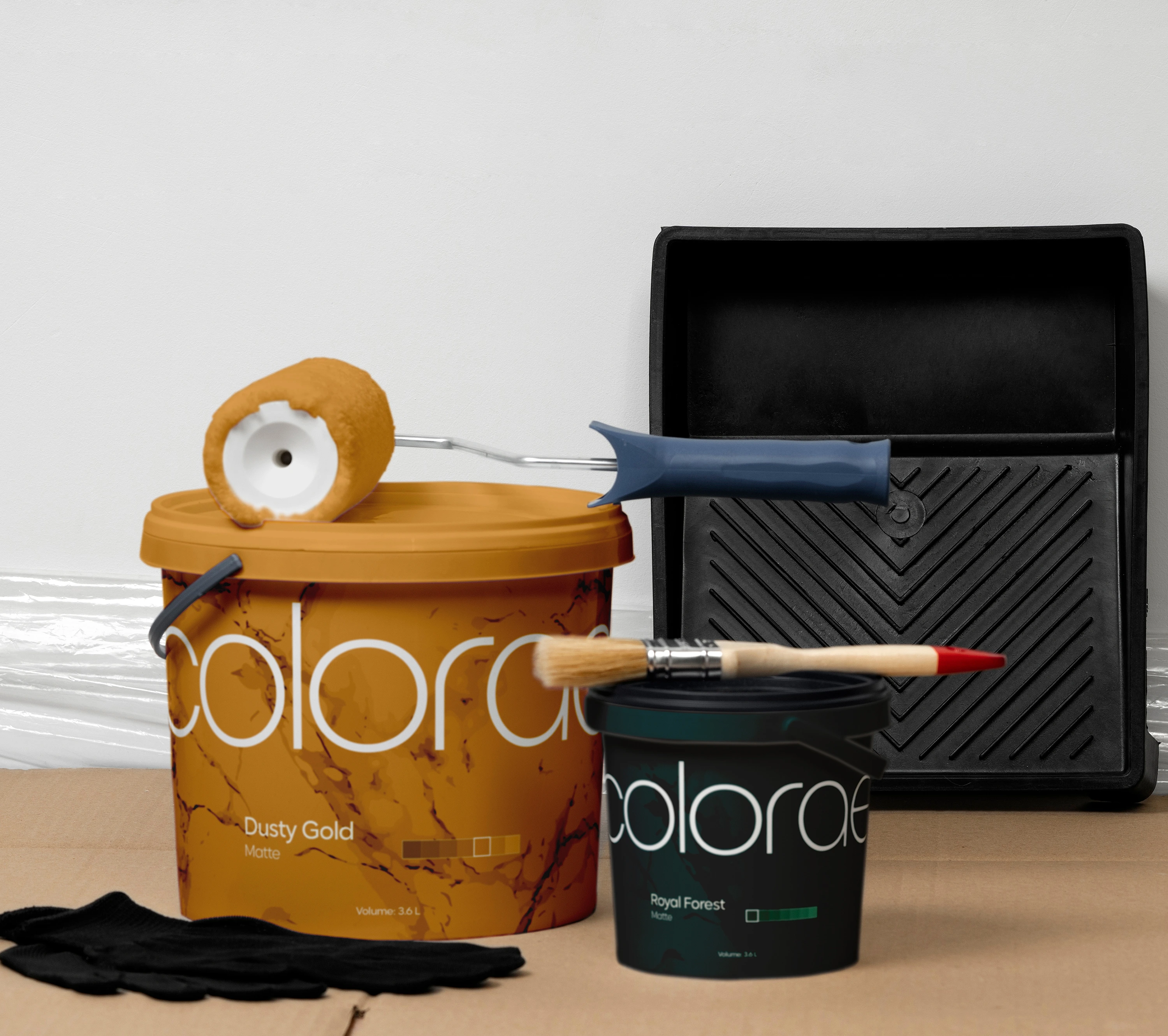
Colorae is conceptual paint brand designed around the idea that color is more than just a personal choice, but also part of a core memory that will determine how you remember moments inside a room, a kitchen, in your office or in your house.
My role: develop the brand’s visual identity and support marketing direction through creative strategy. The project involved competitor and market analysis, concept development, and campaign exploration, translating research insights into a cohesive visual system and applied brand expressions.
Guidelines
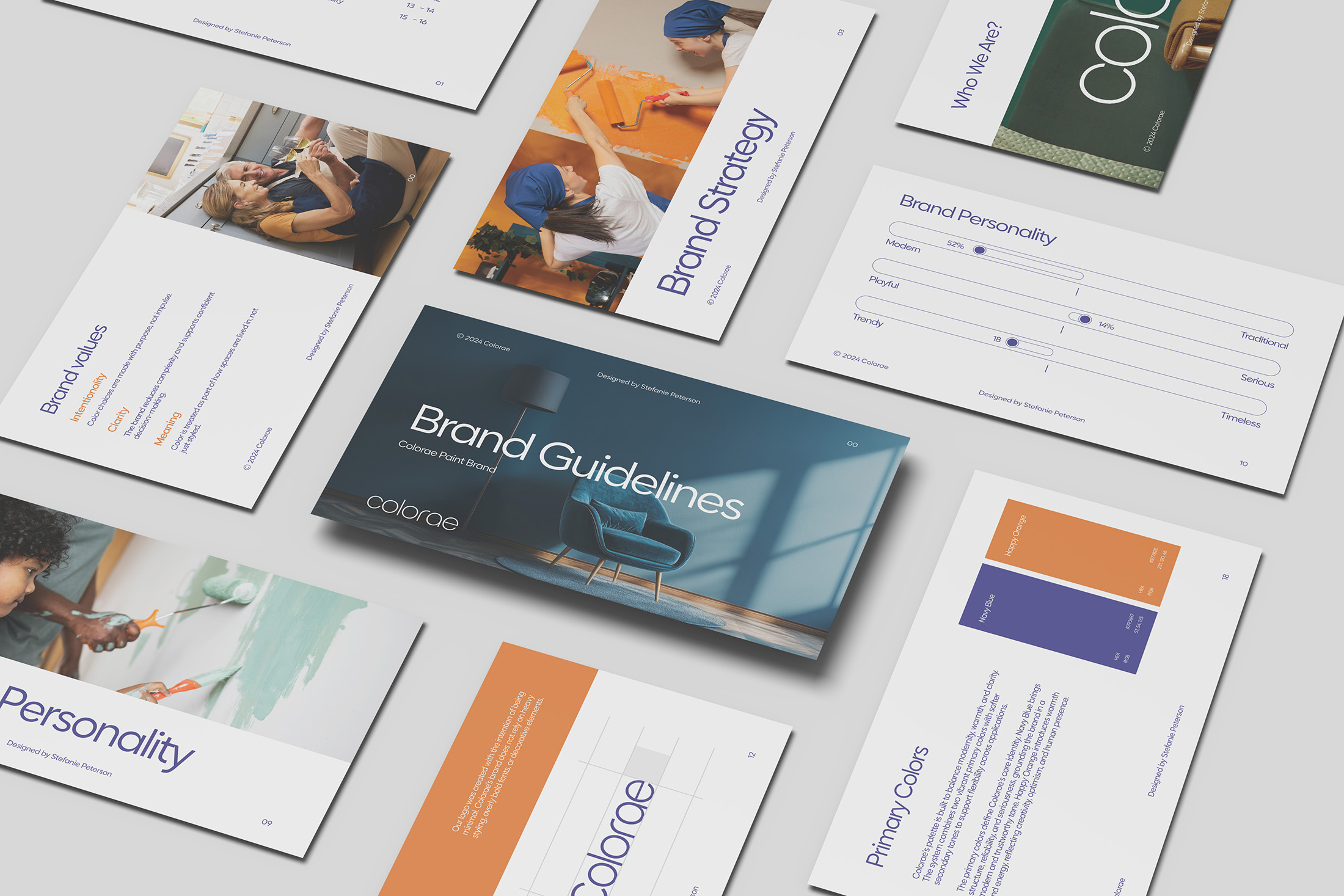
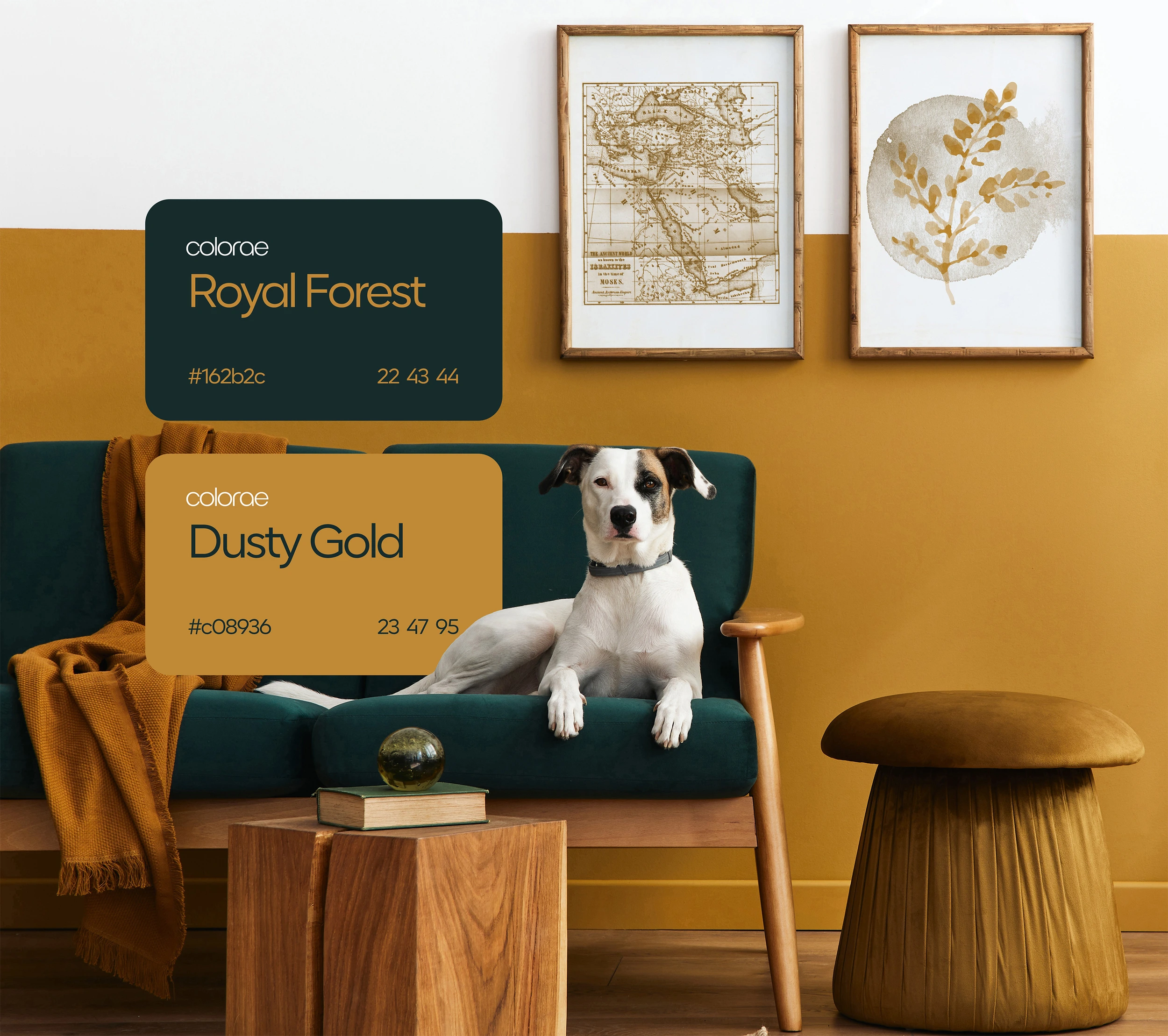
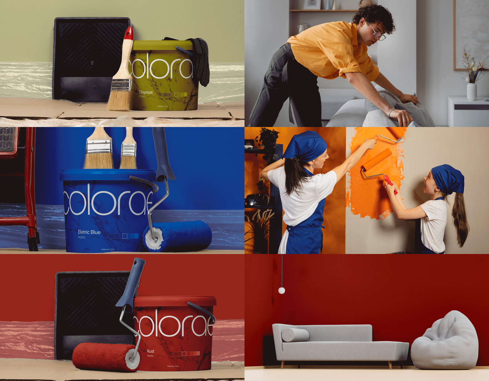
To support the brand strategy, I built out a strong visual identity with two primary colors that work together. Happy Orange brings energy and optimism connecting creativity with personal expression. Navy Blue helps balance this out by adding trust to the palette. Together, these colors create a friendly and modern look that reflects the connection between the brand and the customer. This palette is made to be used across digital and print applications, making it accessible and consistent.
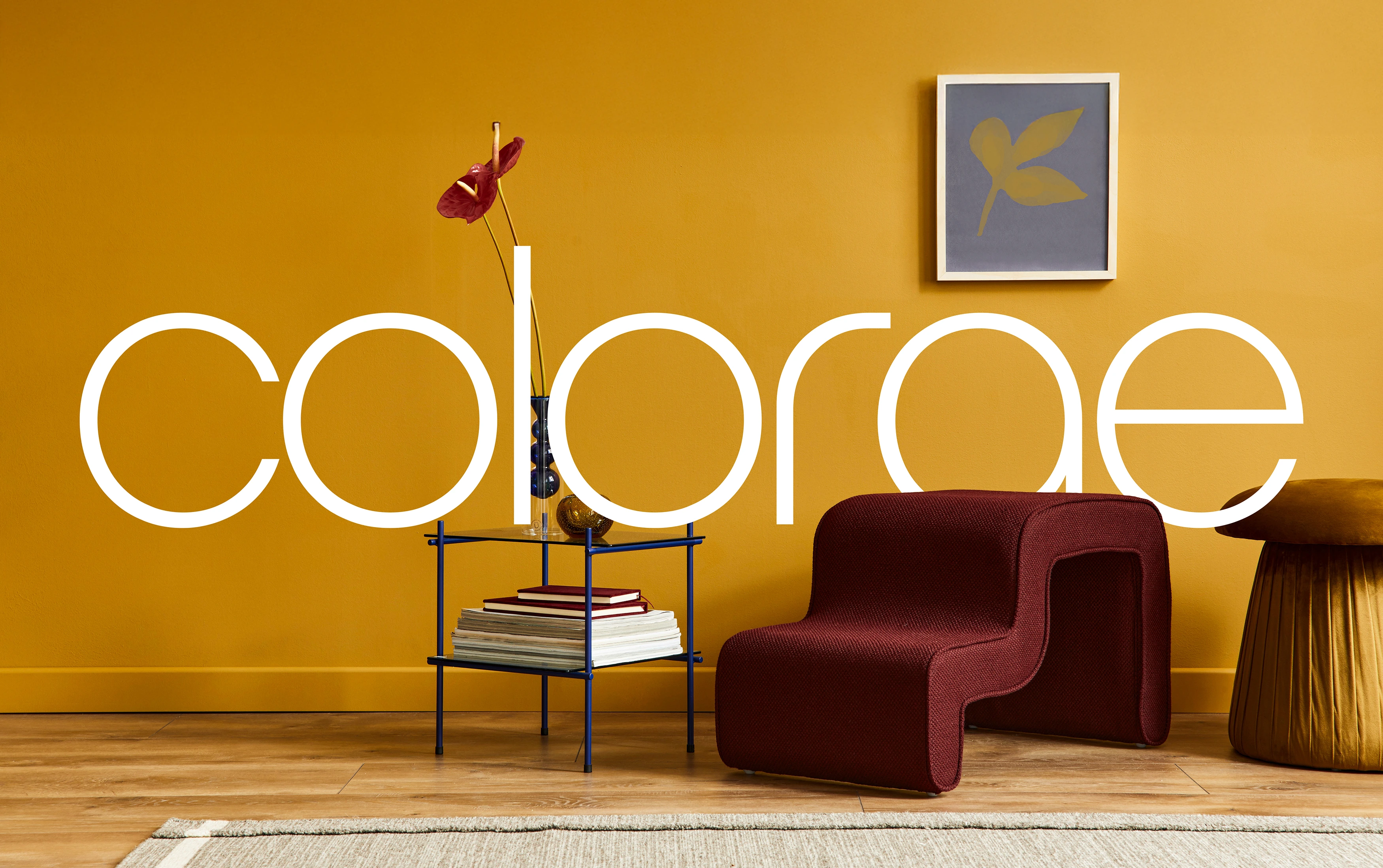
Nicky Sans was my choice as our core font because of its clean structure and high readability. Since this brand is all about color living in everyday environments, I also took on an expressive and colorful approach to the imagery instead of going abstract or overly styled. With the idea of using this across different campaign without losing recognition or coherence, I created a logo that features a very minimalistic design and a flexible usage, allowing the brand to scale.
Campaign Creation
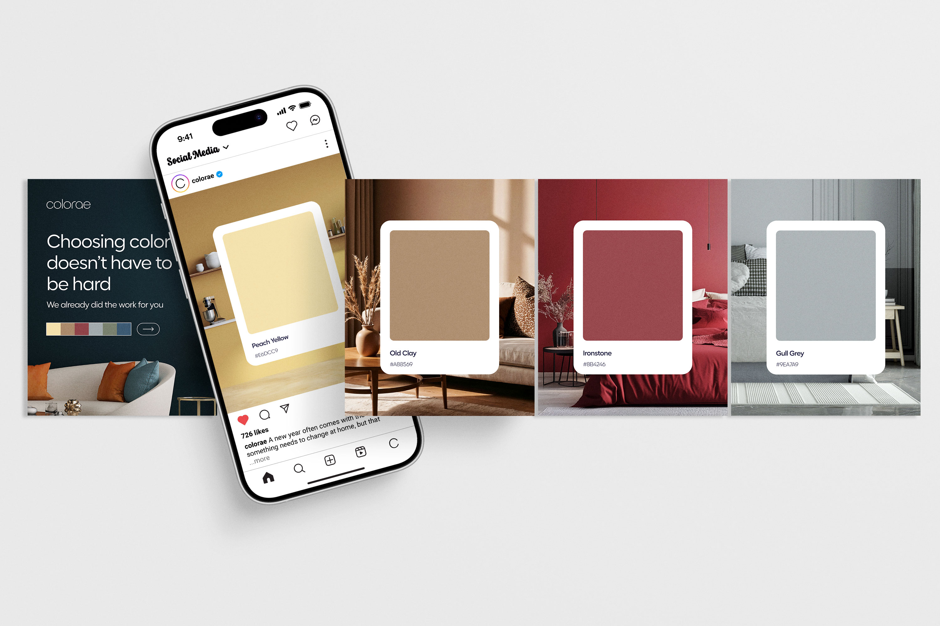
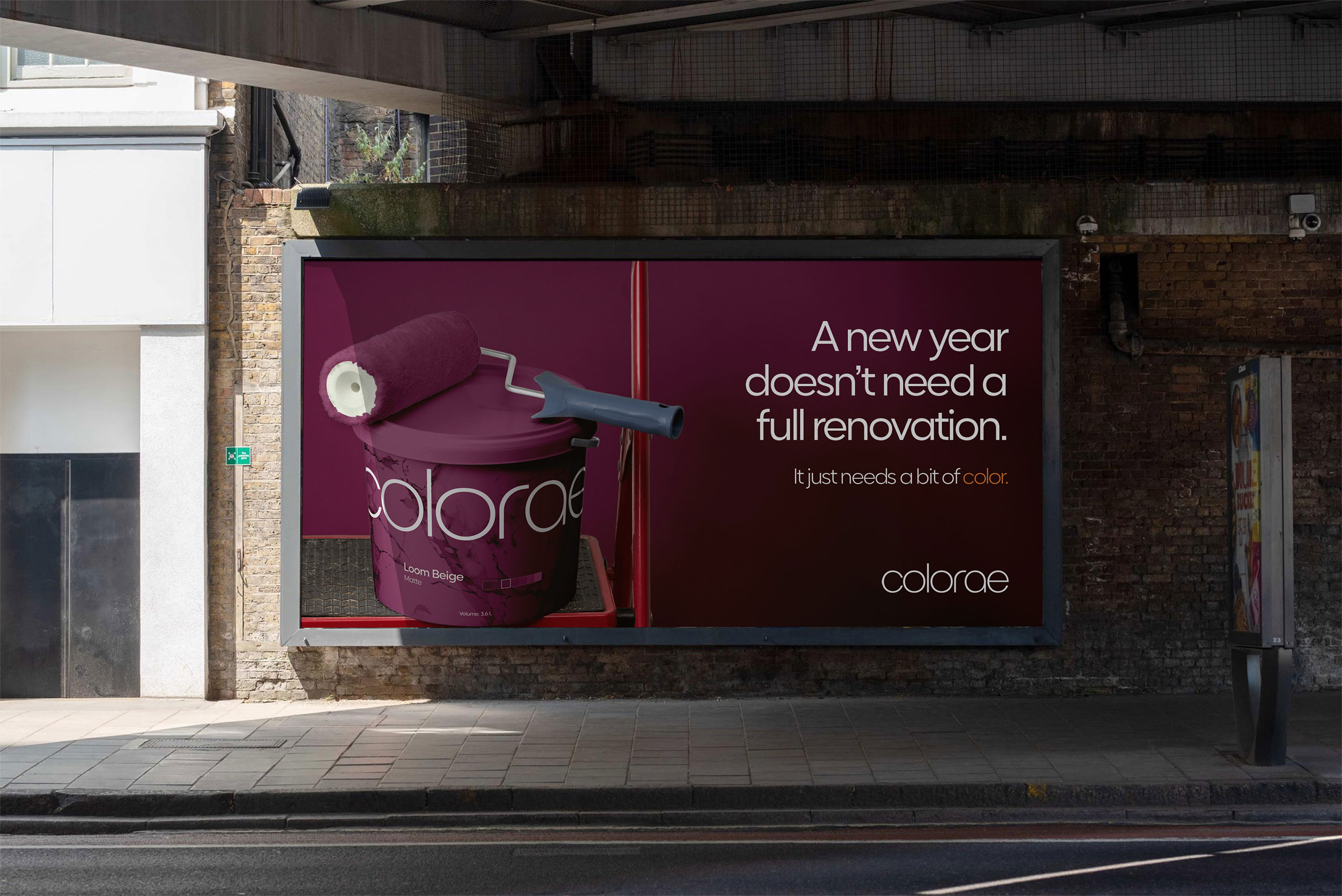
This campaign focuses on moments of transition, especially the beginning of a new year or moving into a new home. Instead of positioning paint as a renovation product, the messaging is focused on positioning Colorae as a trustworthy company that values human experiences, highlighting the quality of our materials and our professionalism.
Copy and visuals are aligned to the brand guidelines and the marketing goals, allowing our voice to sound confident and soft, but not unserious, avoiding exaggerated promises or sales-driven language. The messaging is crafted to generate interest to our new set, urging customers to take advantage of the exclusive products and promotions without sounding salesy. The tone is approachable, and focused on highlighting the quality and value of the products.
Problem and solutions
One of the main insights from research was how overwhelming choosing paint colors feels for many people. Customers want color, but they are afraid of making the wrong decision or confused about how and what to choose.
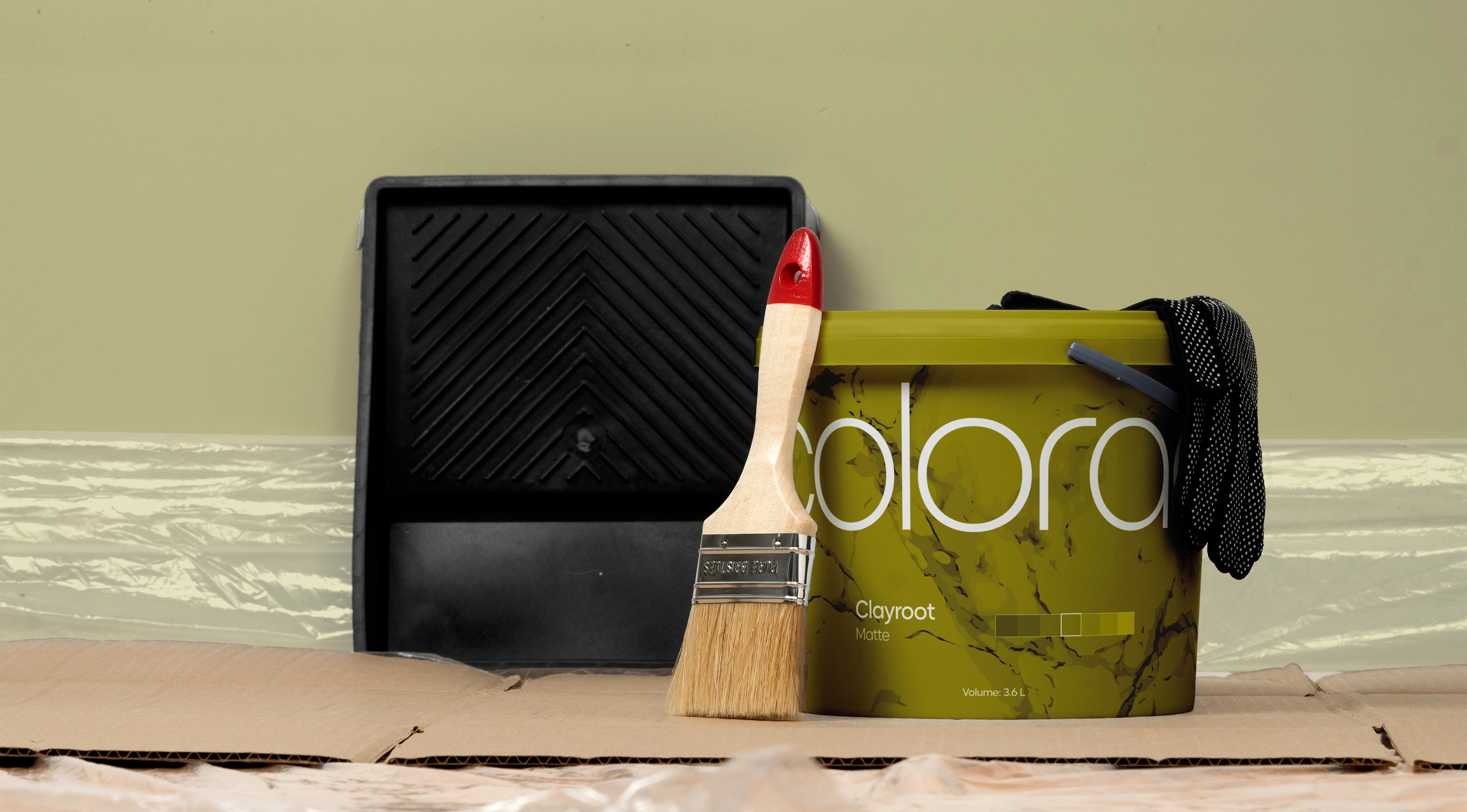
Large paint brands often offer thousands of options, which increases uncertainty rather than confidence. The problem is the lack of clarity, instead of the lack of colors to choose from. Colorae approaches color as a system rather than isolated choices. Instead of pushing endless options, the brand introduces selected color sets designed to work together across different rooms and lighting conditions. The goal was to reduce decision confusion and help customers feel more confident, especially during moments of transition like moving into a new home.
 Stefanie Peterson
