Cora

Overview
Cora is a conceptual organic skincare brand developed as a personal branding project. The goal was to explore how a natural, eco-conscious positioning could be translated into a cohesive visual identity and packaging system.
My job was focused on translating these values into visual elements, including logo design and packaging concepts, creating a consistent and recognizable brand universe.
This project allowed me to experiment with brand storytelling, visual symbolism, and packaging design within the skincare space.

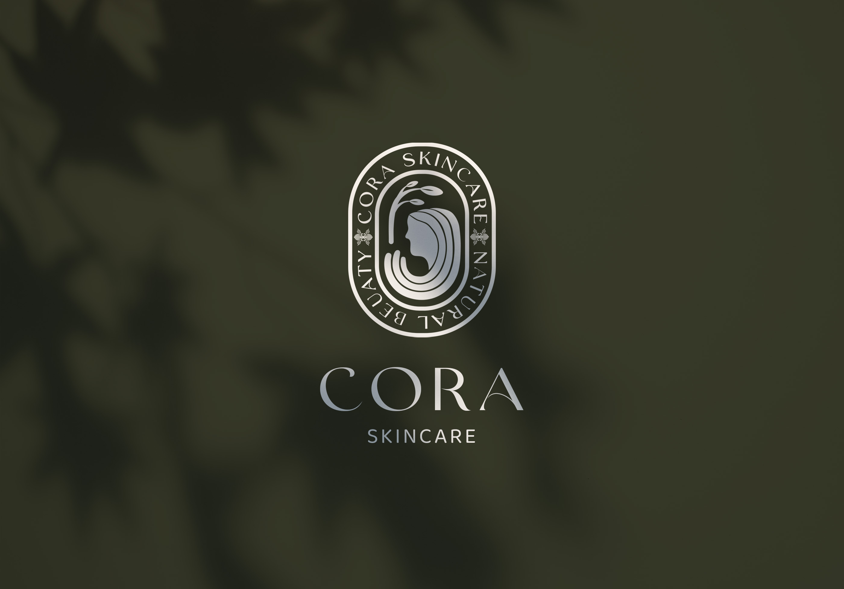
Concept
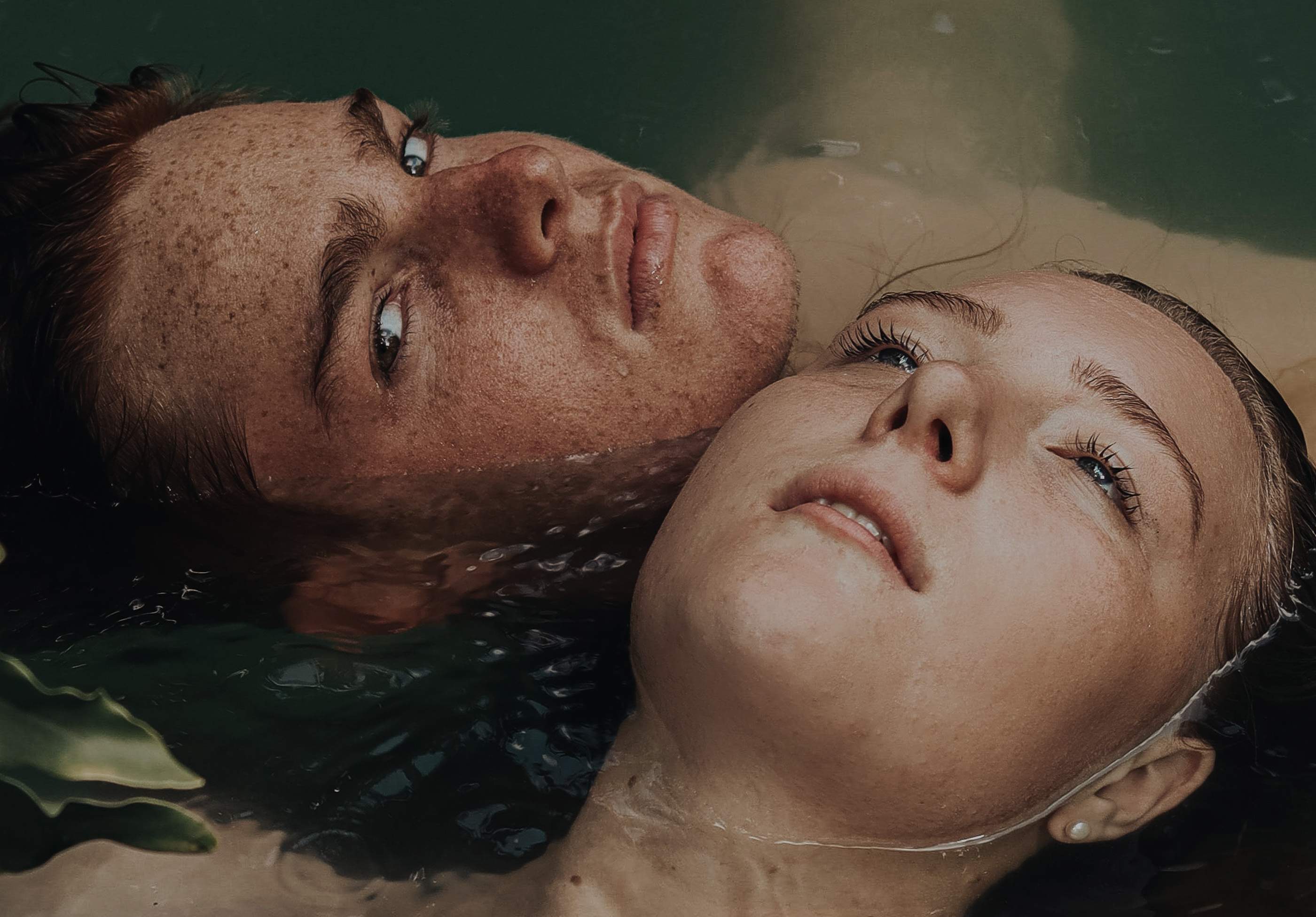
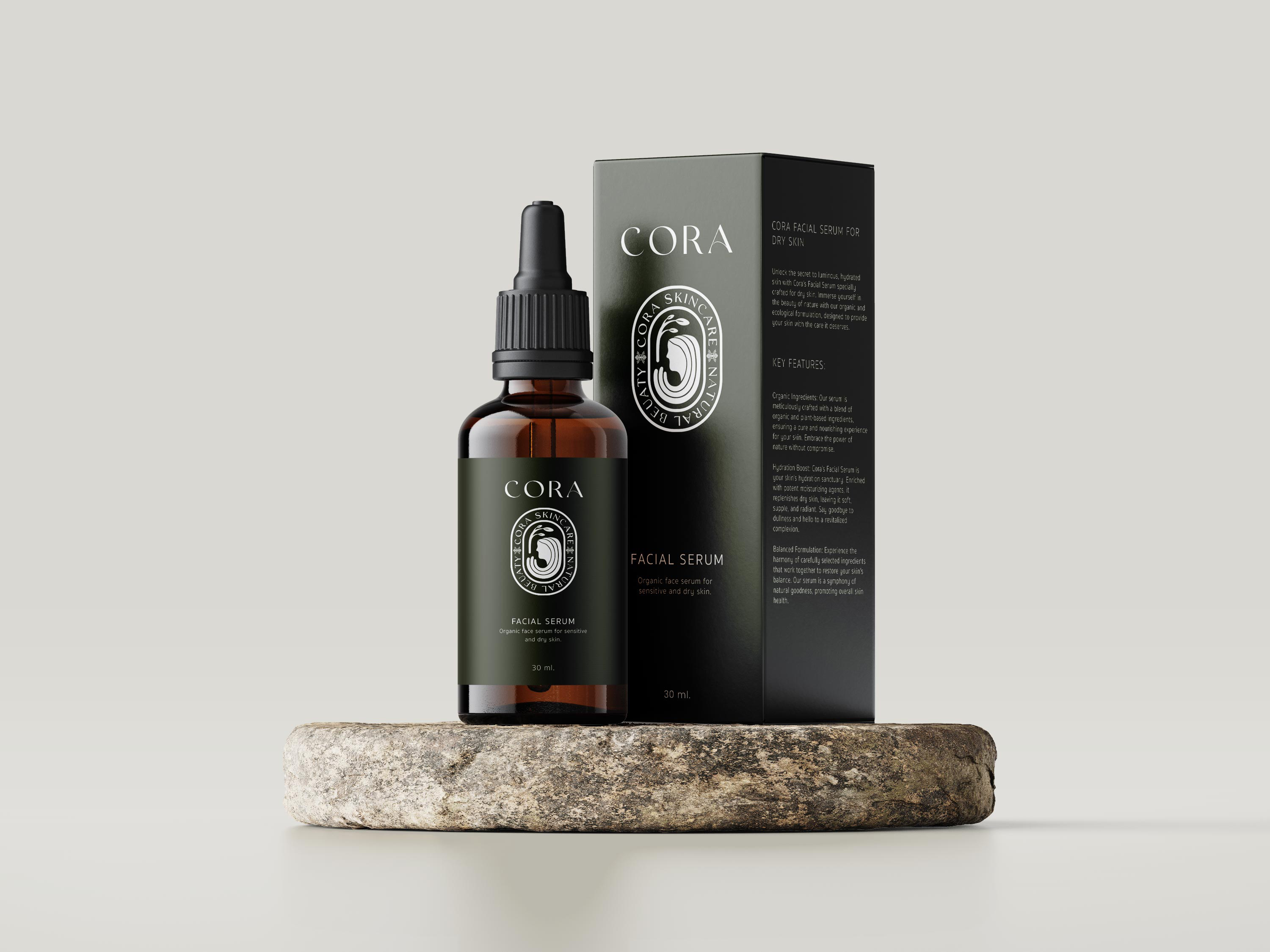
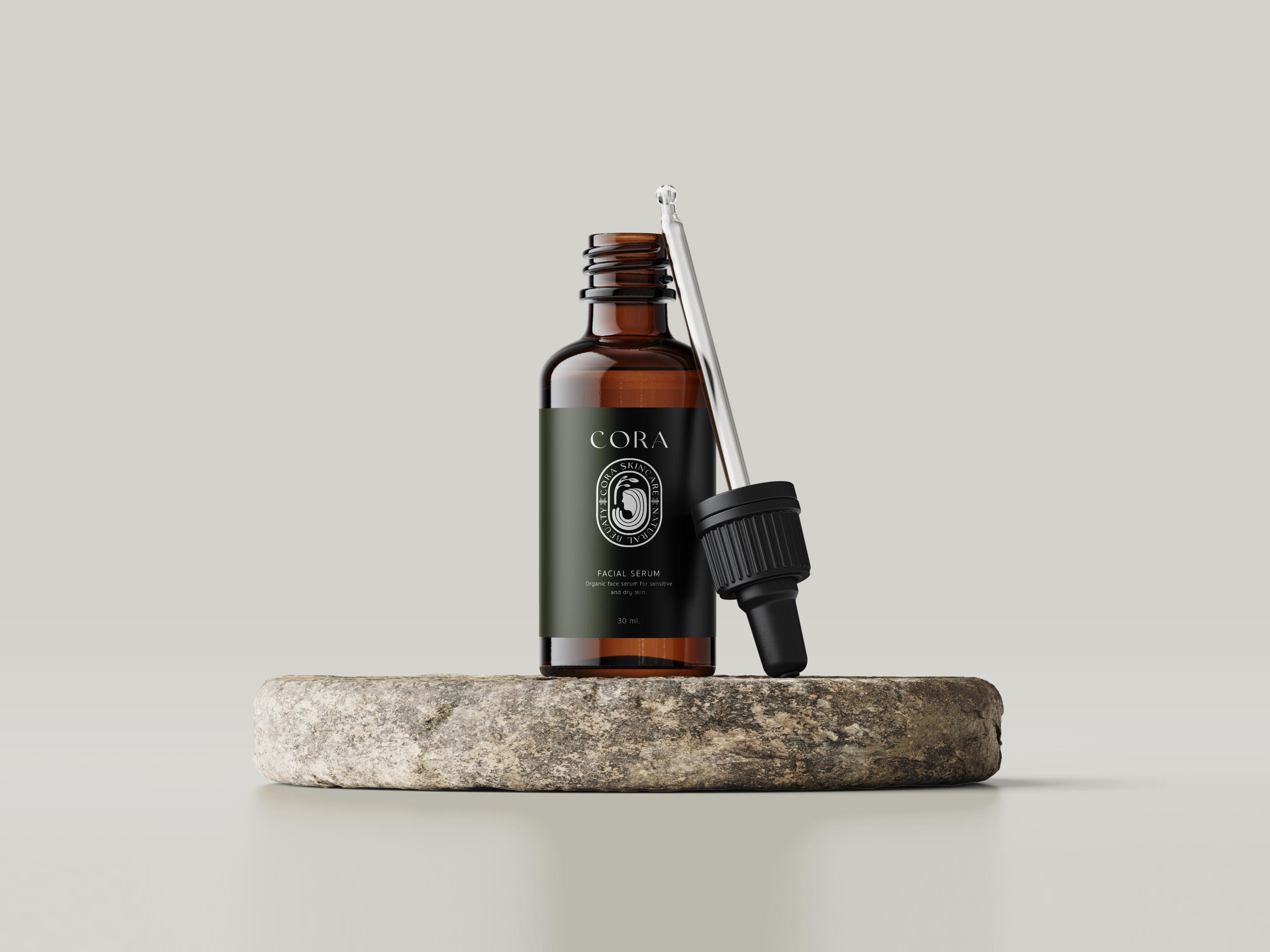
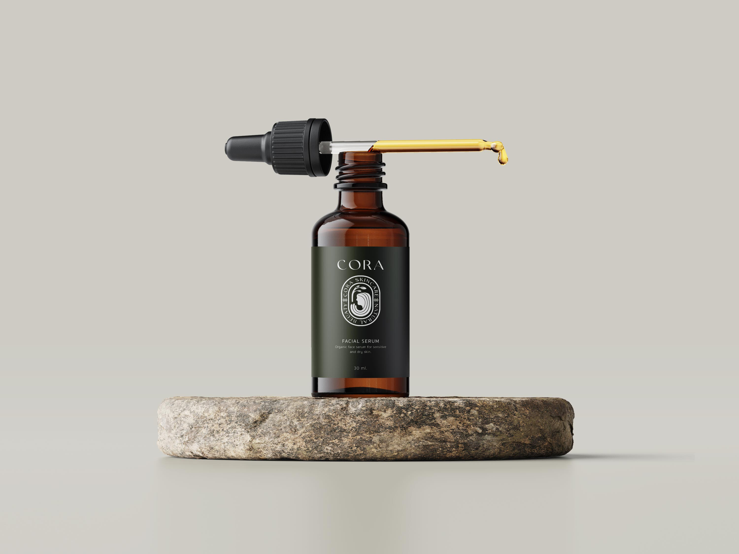
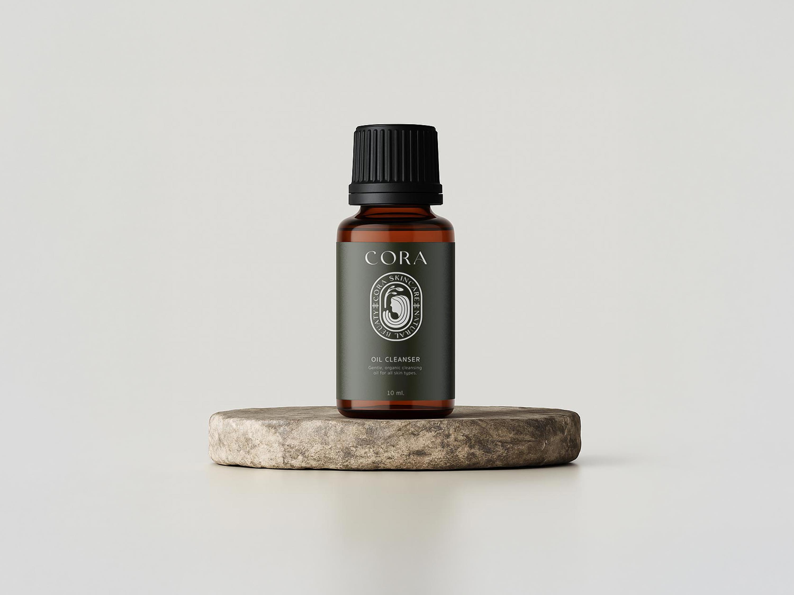
Cora concept is centered on organic skincare, and a grounded relationship with nature. Earthy tones, recyclable materials, and minimalistic yet elegant designs guided the visual direction, creating a balance between nature-inspired aesthetics and functionality.
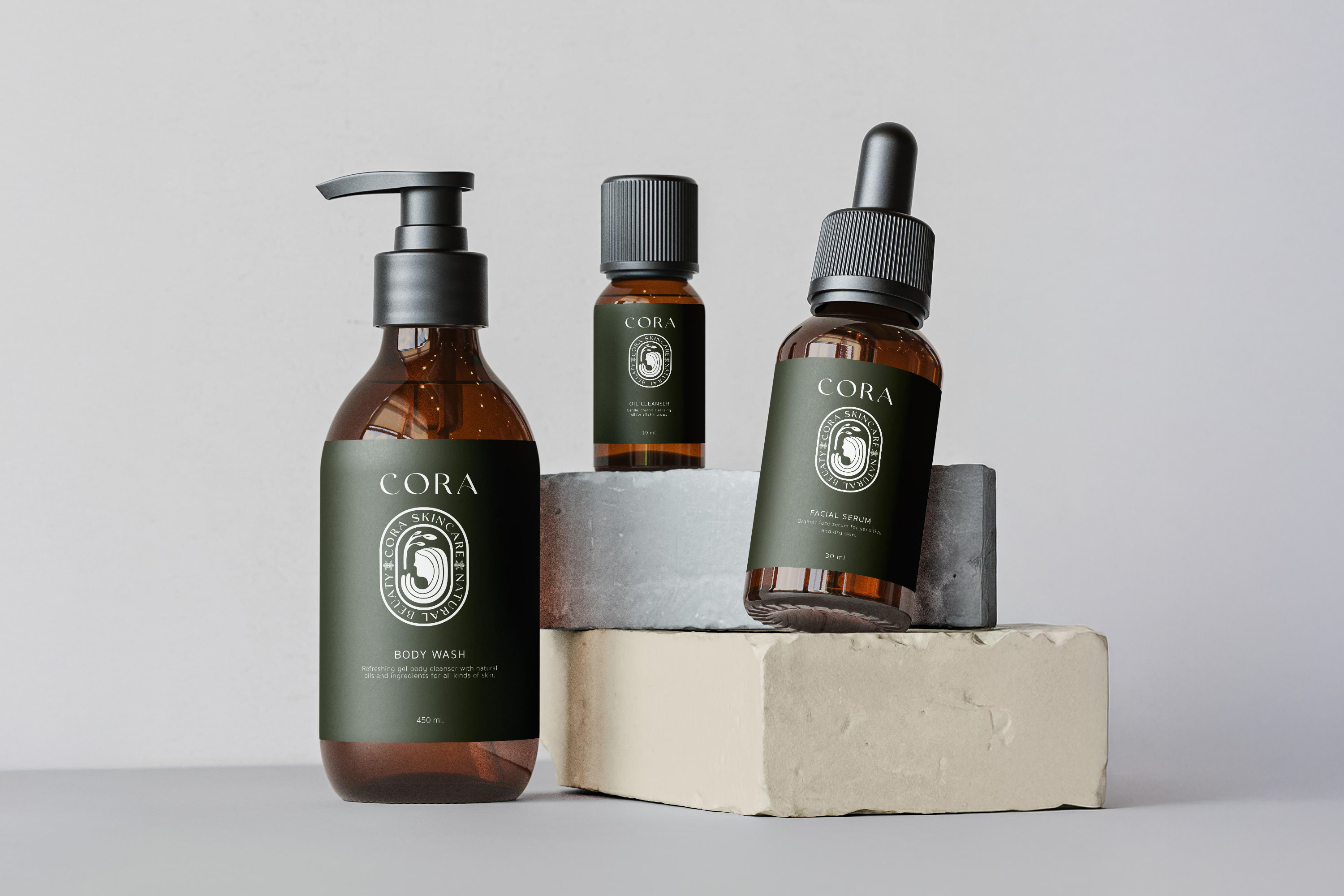
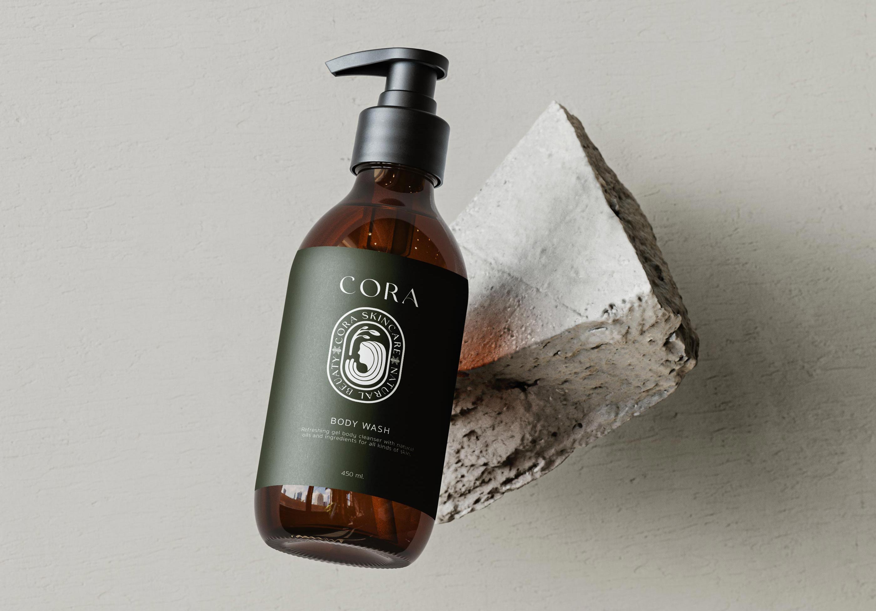
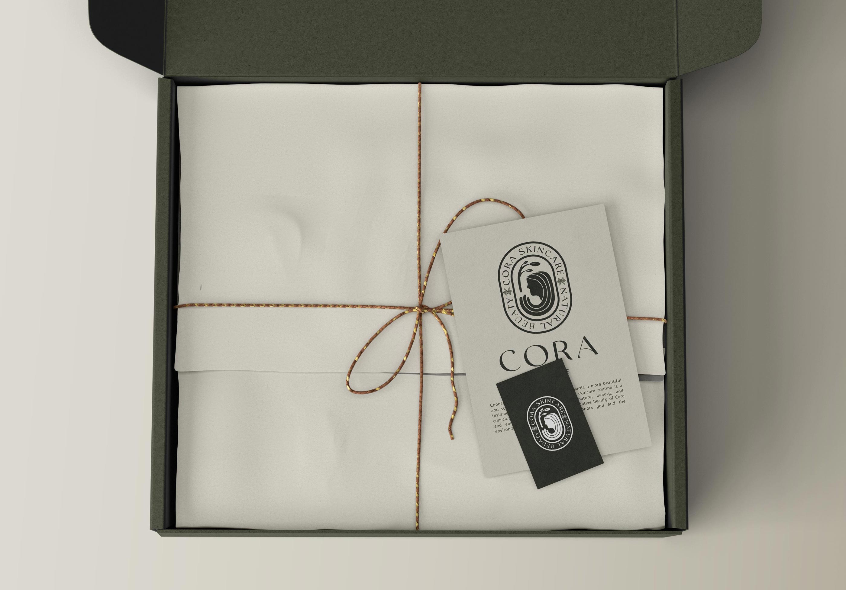
packaging
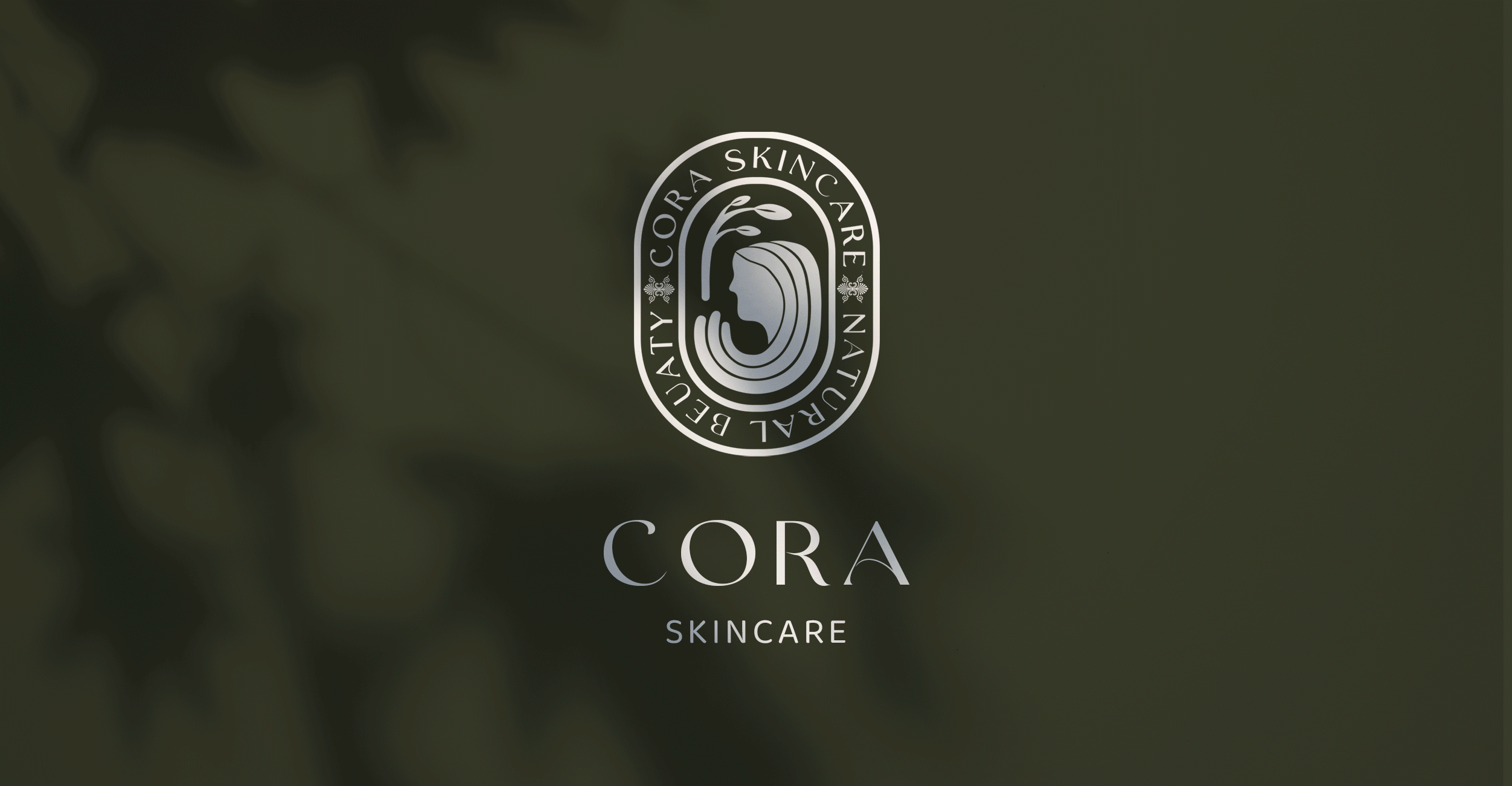
The packaging designs were developed to visually communicate trust, simplicity, and transparency, reflecting an eco-conscious mindset through material choices and restrained visual elements, reinforcing the brand’s positioning as responsible skincare. The Greek-inspired logo references Mother Earth, emphasizing longevity and balance, with a font choice that complements the idea of simplicity.
"Revitalize,
Rejuvenate,
Radiate"