Malina
Overview
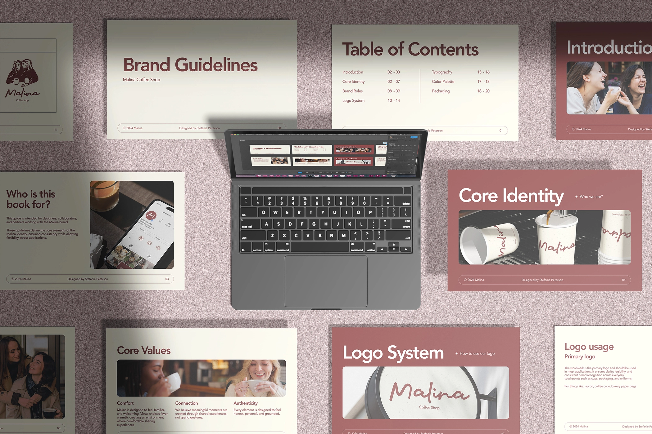
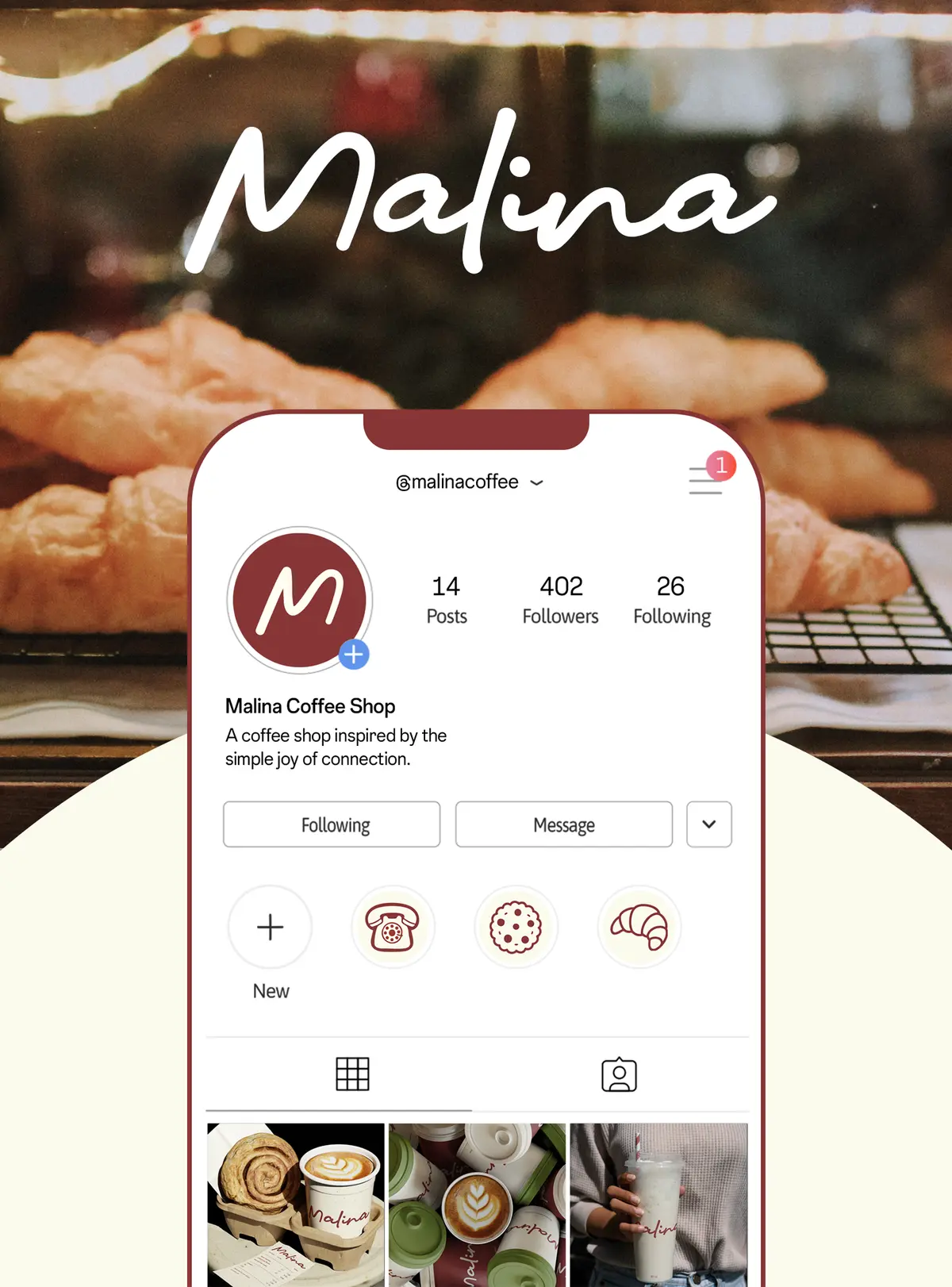
Malina is a conceptual coffee shop brand built around the bond between a mother and her daughter. This project demonstrates my process of translating brand values into a cohesive visual identity. The work includes a logo, packaging, social media visuals, and illustration style, all designed to create a warm and approachable brand presence.
My role: As a ceative Ddesigner, I developed the full brand identity and visual language for this conceptual coffee shop. Focus areas included logo design, packaging, social media visuals, illustration style, and tone of voice. The exercise demonstrates how I approach brand-building from insight to execution
The Logo
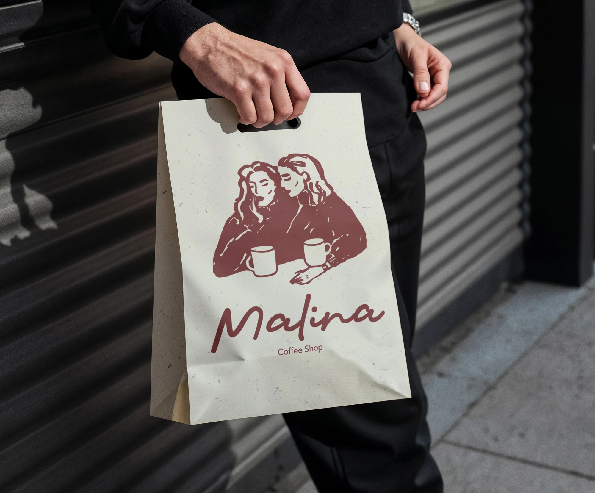
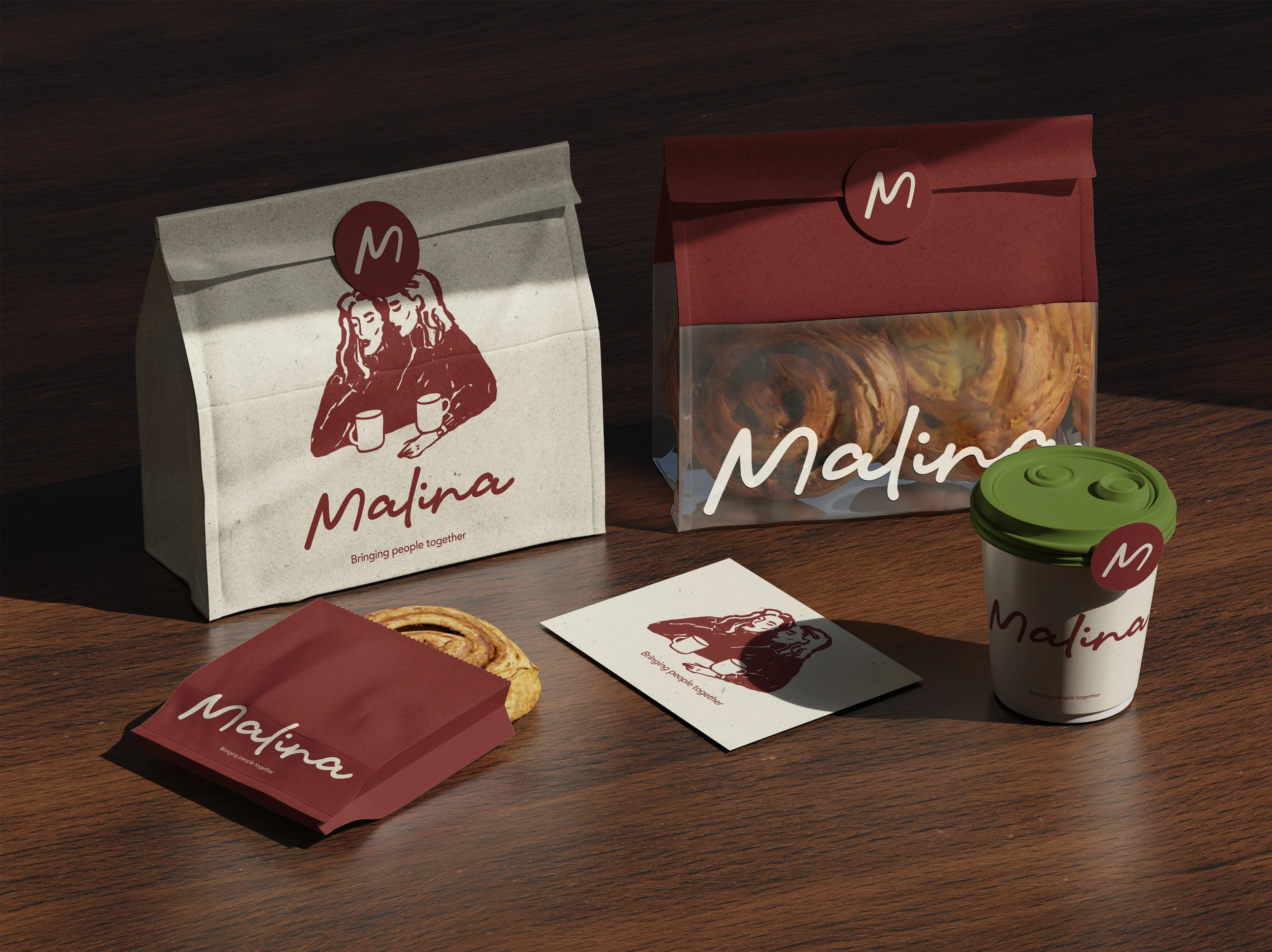
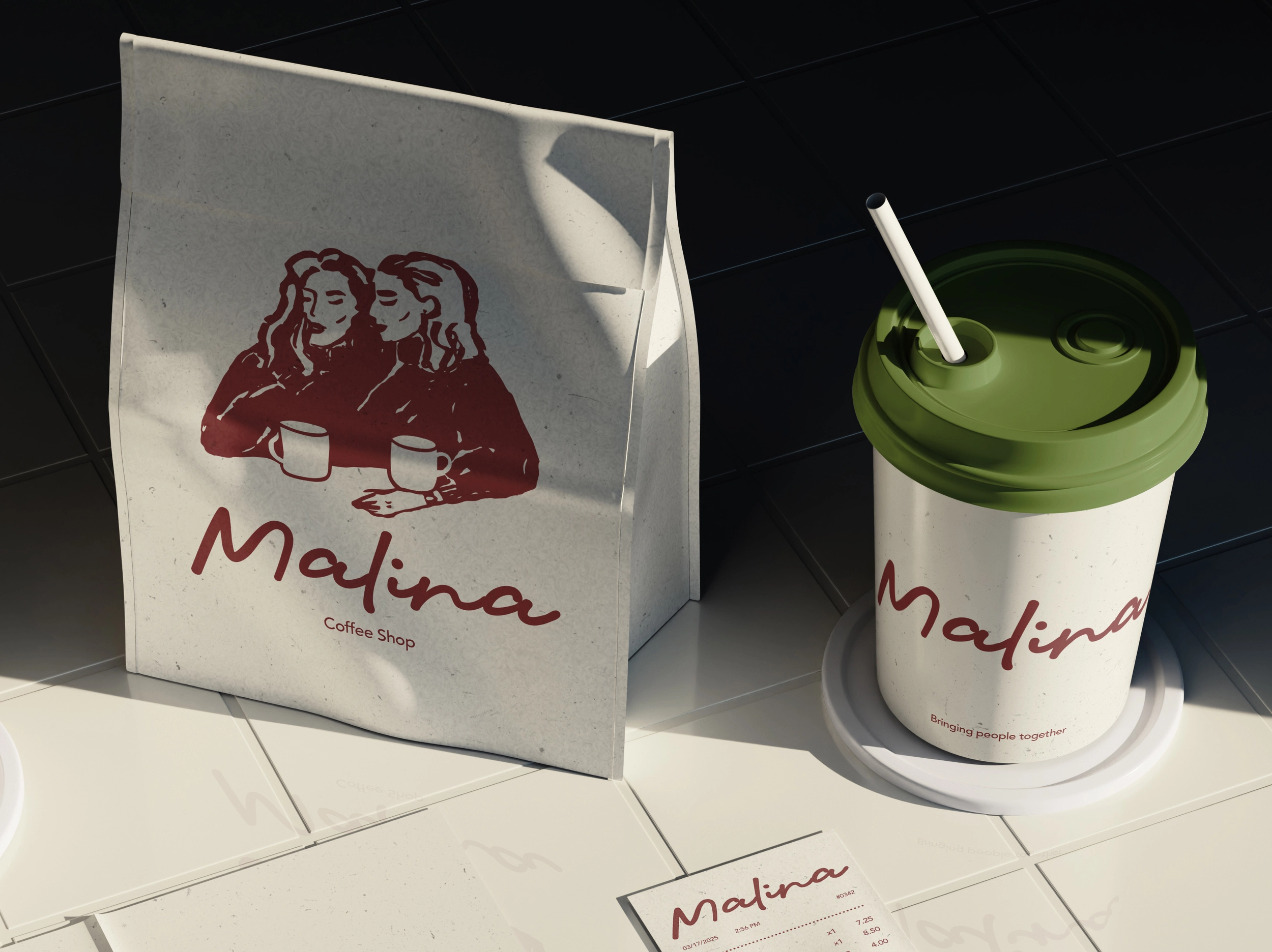
I designed the logo with a combination of illustration and typography to reinforce the brand’s core idea of connection. The custom illustration of two women sharing coffee functions as a visual metaphor for shared moments and human closeness, shifting the focus away from the product and toward the experience around it.
The wordmark uses a handwritten typeface to introduce a personal and intimate tone, as if the name were written by the founder herself. This choice supports the brand’s warm and approachable personality, creating a sense of familiarity and direct connection with the customer.
Concept & Discovery
Malina was developed as a conceptual coffee shop brand exploring the idea of coffee as a shared ritual rather than a product. The initial discovery was that many coffee brands focus heavily on trend-driven aesthetics or performance messaging, often overlooking emotional connection and everyday intimacy. This project aimed to explore how a brand could feel personal, warm, and human without relying on nostalgia or clichés.
Business Problem
The core challenge was to create a brand identity that could stand out in a saturated coffee market while remaining simple, approachable, and emotionally grounded. The brand needed to communicate trust and warmth without feeling overly playful, decorative, or premium-focused.
my choices
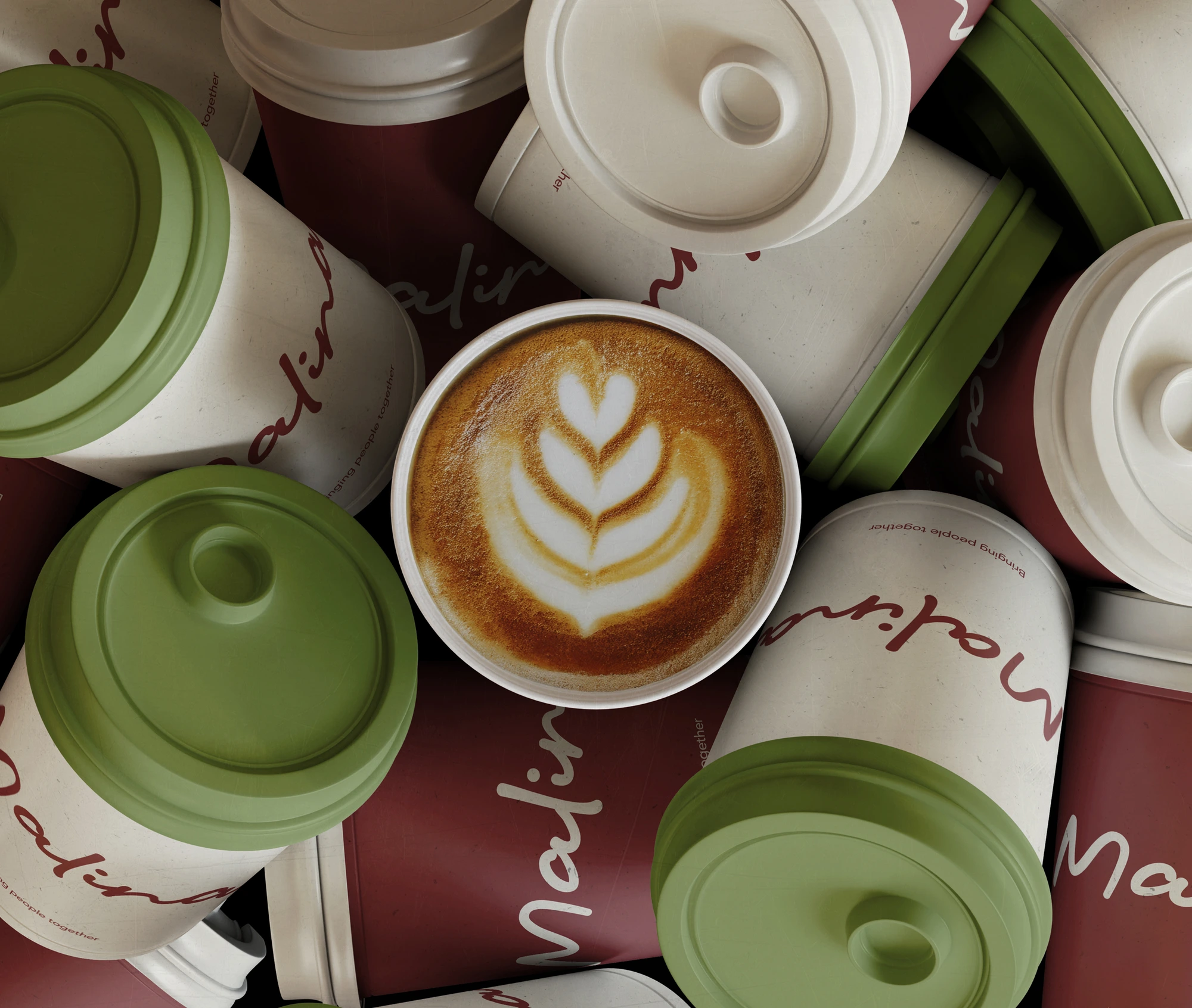
The visual system was designed to translate emotional closeness into tangible brand elements. Warm, muted tones were chosen to create a sense of comfort and familiarity, while a minimal design system ensured clarity and consistency across touchpoints.
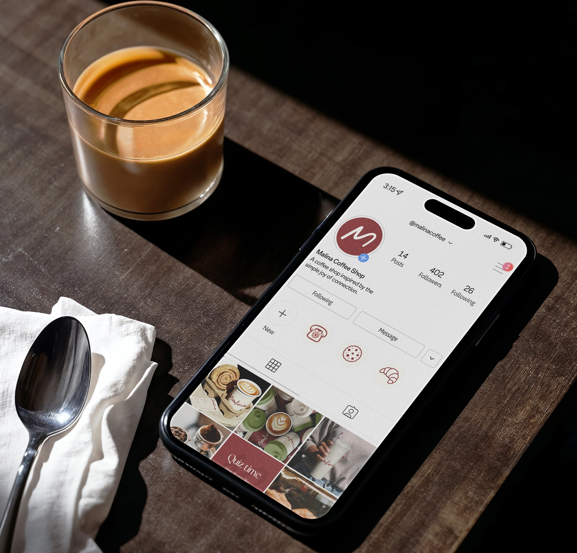
Illustration played a central role in reinforcing the brand narrative. The visual system was built to be flexible, allowing the illustration, wordmark, and color palette to be used independently or together depending on the application.
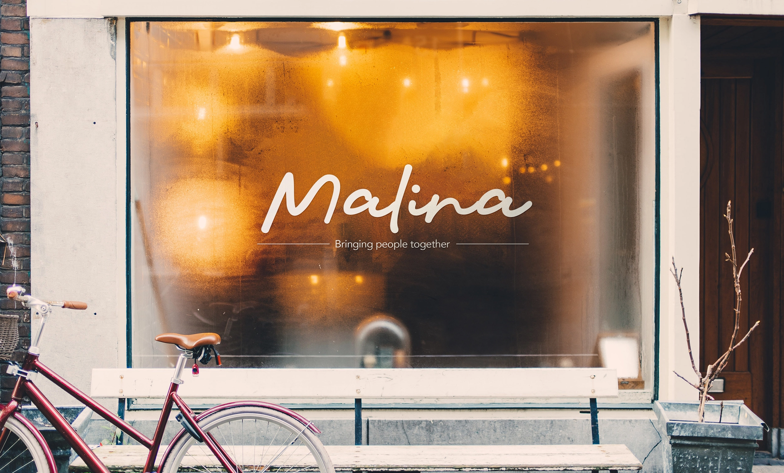
"Bringing
people
together."