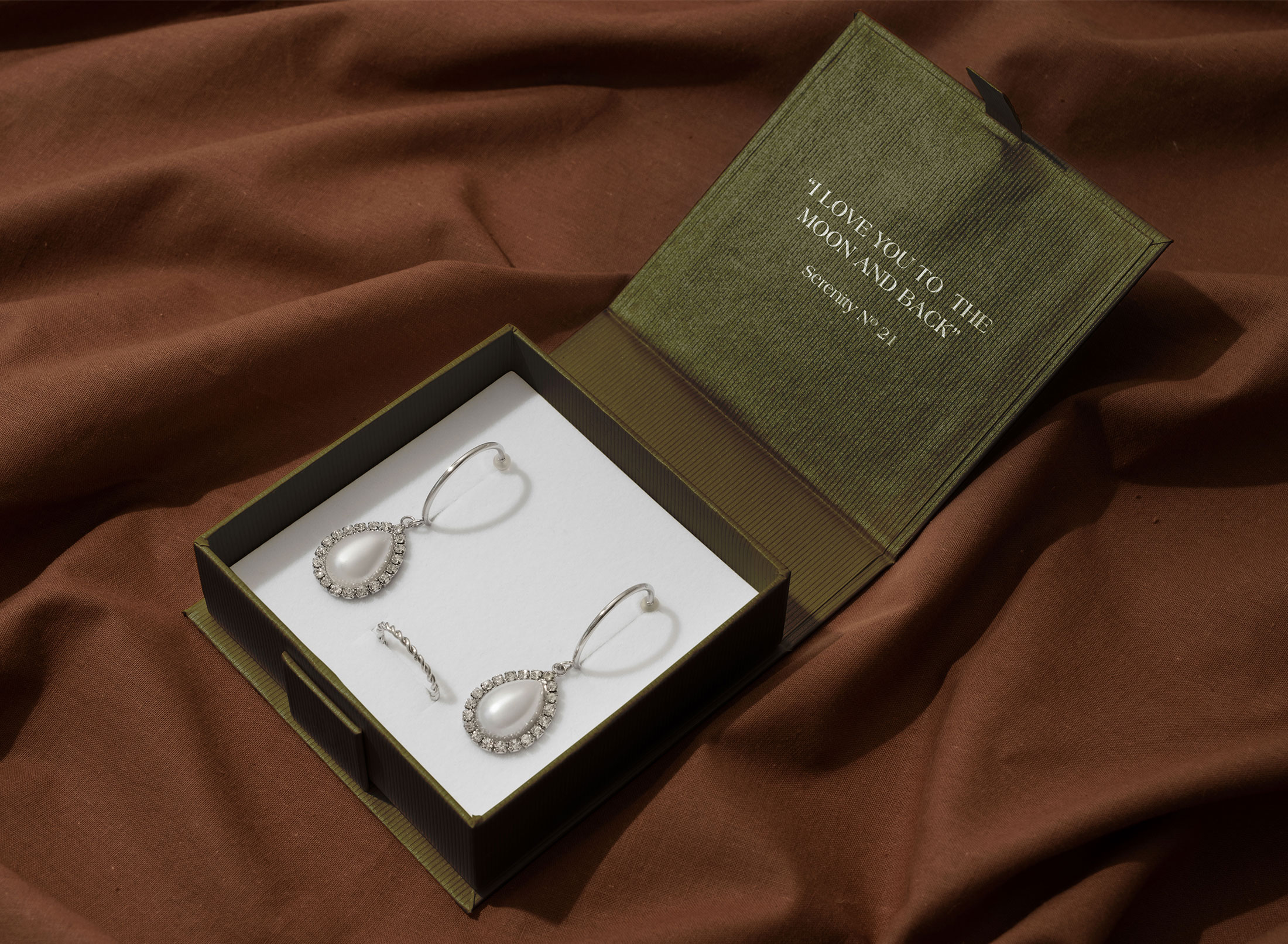
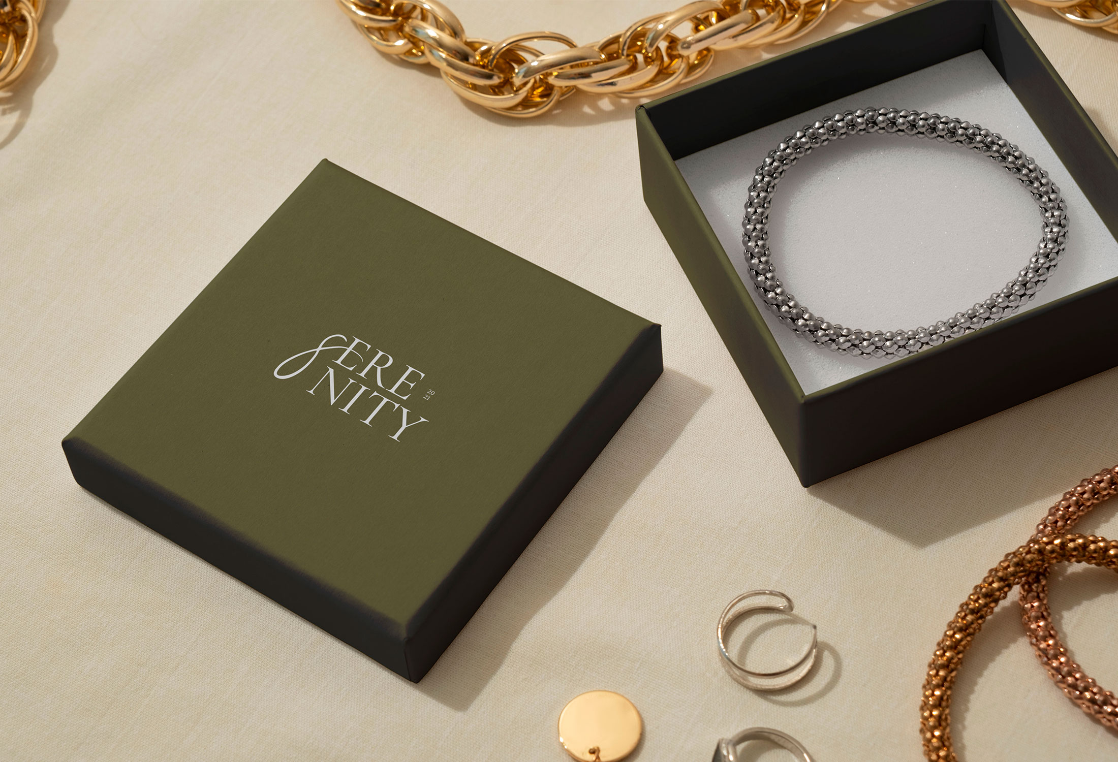
Serenity
Overview
Serenity is a conceptual jewelry brand created as a full-scope branding and digital design project. The goal was to explore how a modern jewelry brand aimed at a female audience could translate clarity, and elegance across brand identity, digital experience, and marketing touchpoints.
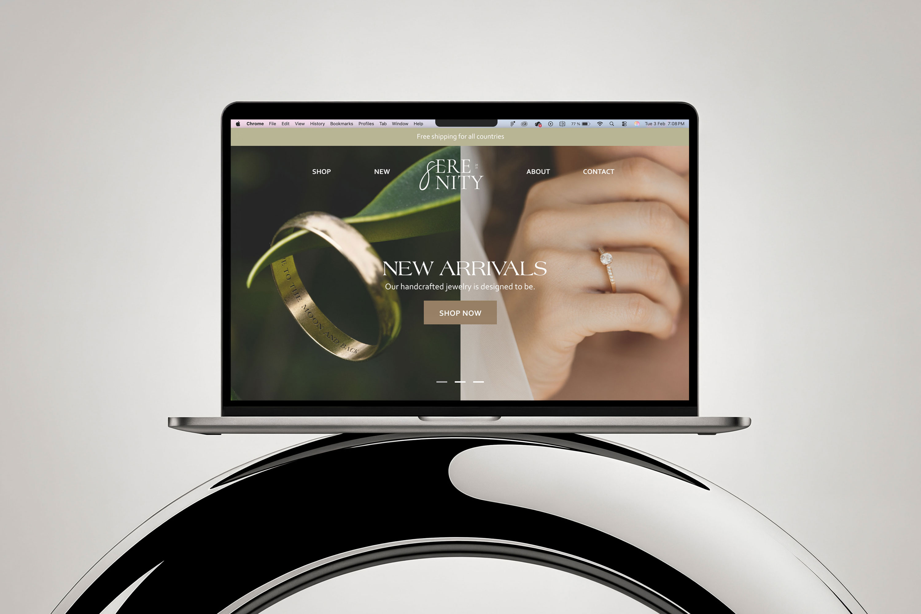
My role: I was responsible for designing the brand from the ground up, including visual identity, website UI, basic UX, and marketing assets. The focus was on building a cohesive system that could realistically support a real e-commerce brand.
The Challenge
Jewelry shopping online often overwhelms customers instead of helping them decide. Shoppers are presented with large product catalogs, unclear collections, limited context, and insufficient guidance to compare pieces. This makes it difficult to understand differences between products, imagine how items will look when worn, and choose confidently.
As a result, many users browse without purchasing, abandon carts, or leave the site to continue their search elsewhere.The challenge of this project was to design a digital jewelry experience that reduces confusion, supports comparison, and guides users toward confident purchase decisions, while still supporting brand recognition and sales goals.
Research & Discovery
This project was informed by qualitative competitor research and user behavior analysis, focused on how women navigate, evaluate, and purchase jewelry online.
The research combined competitor homepage analysis (structure, navigation, content order), E-commerce best practices for jewelry brands and customer behavior patterns and common purchase barriers in online jewelry shopping. The goal was not to validate a product, but to understand how successful jewelry brands help users move from browsing to choosing.
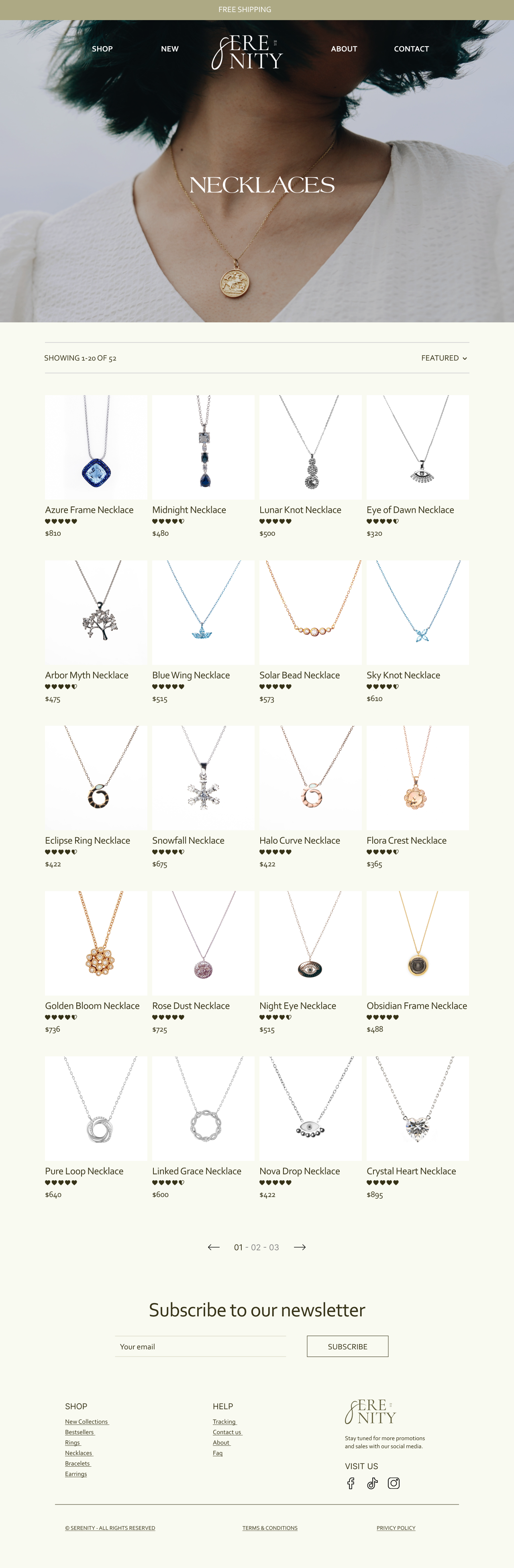
Shopping
Jewelry behaves very differently from clothing. Most jewelry brands avoid heavy filtering (size, material, price sliders, etc.) on category pages for a few practical reasons. The simplicity on decision beats precision when it comes to choosing necklaces for example.
Too many filter increases cognitive load. Unlike clothing, jewelry sizing is often inconsistent, limited, or irrelevant for early browsing. Another reason why filtering should be kept simple is because the product ranges are usually smaller. Best sellers and sorting matter more than specs.
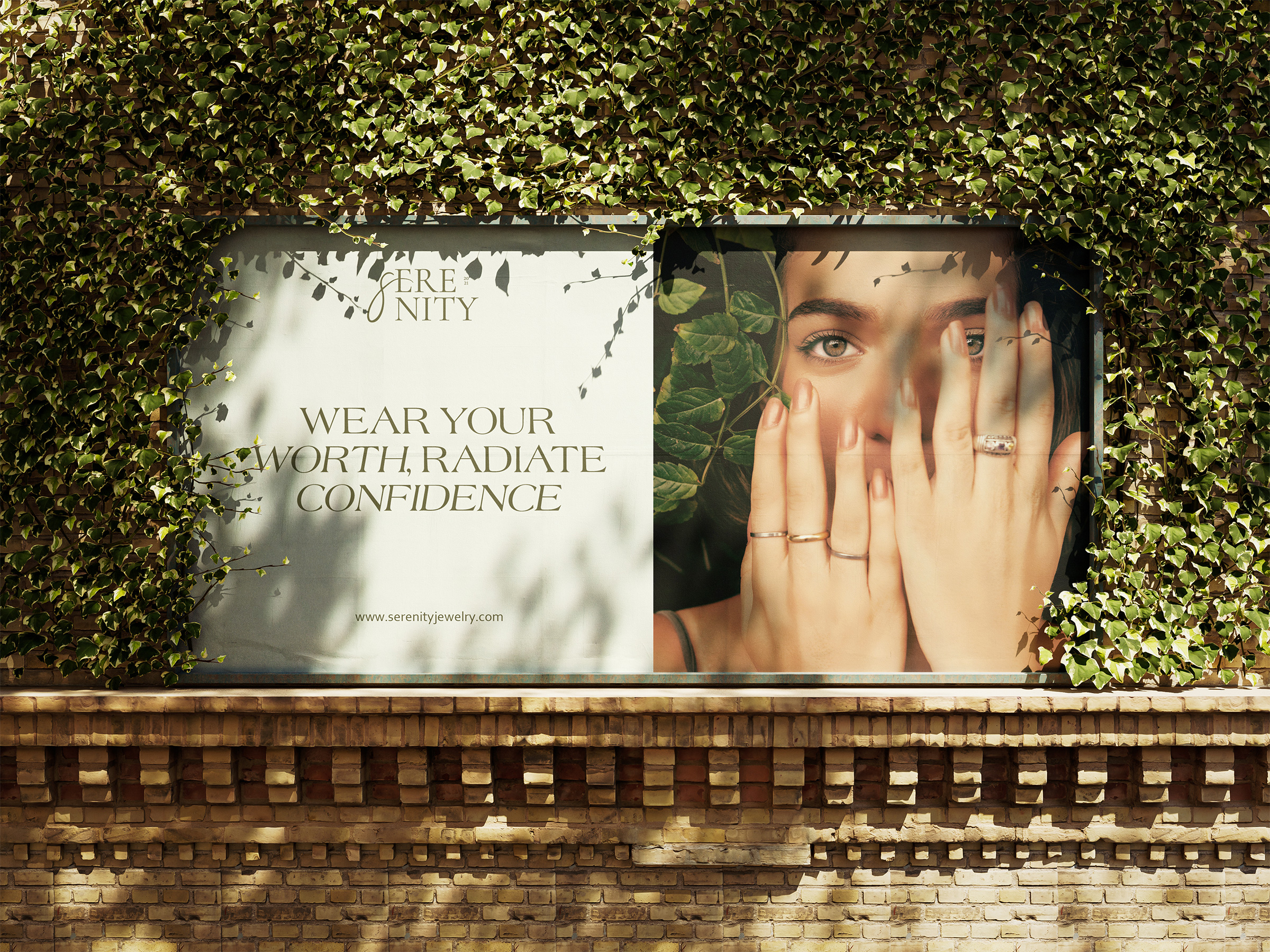
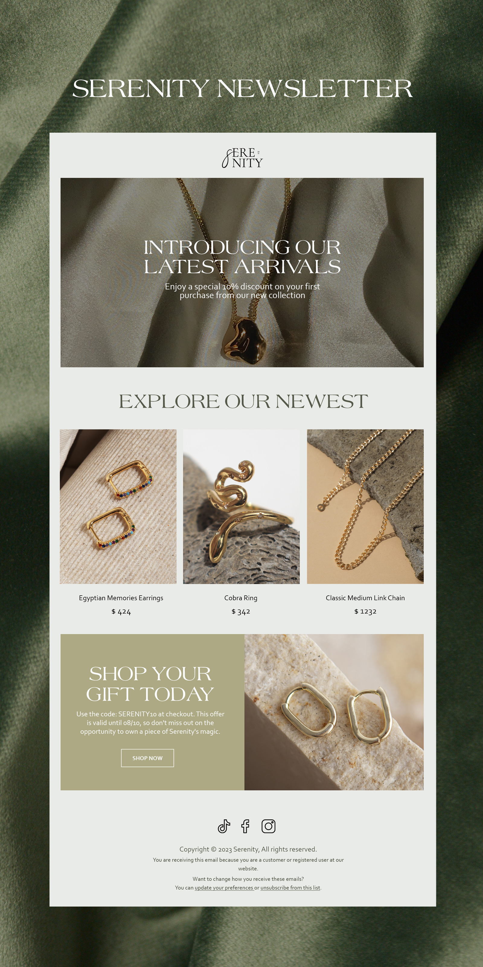
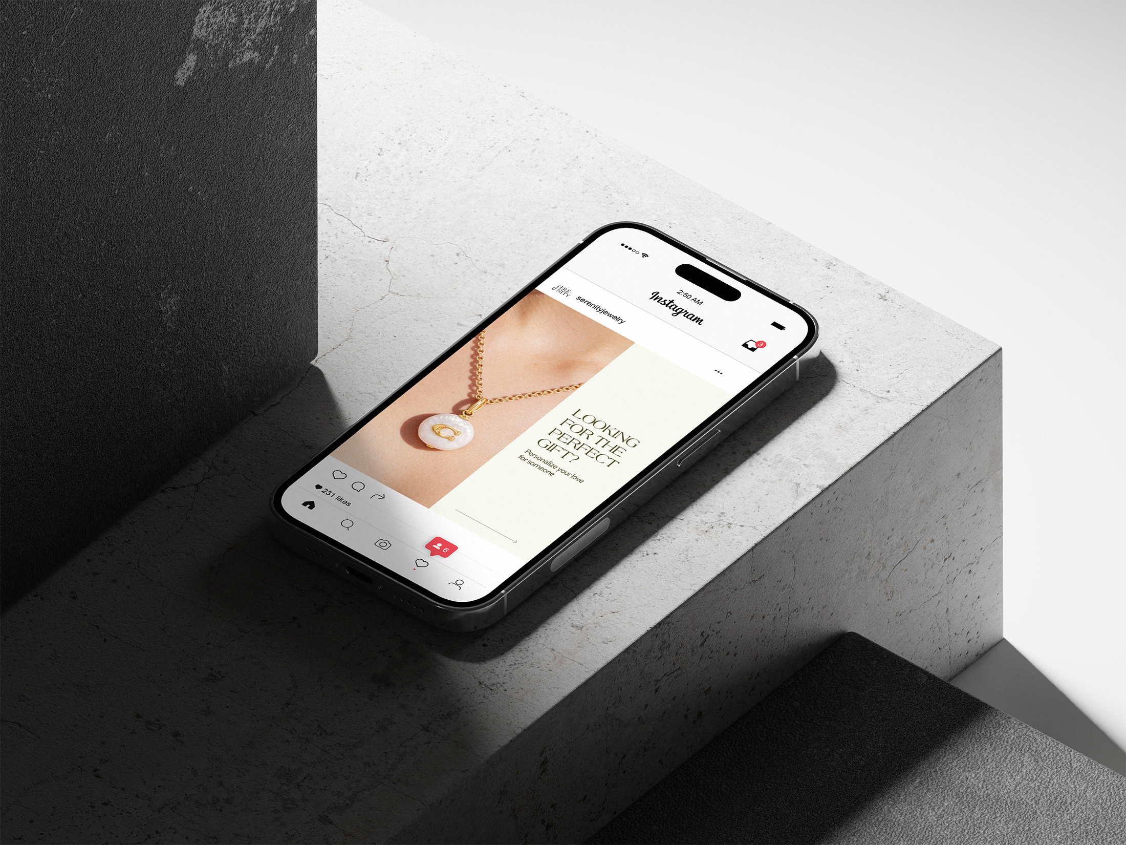
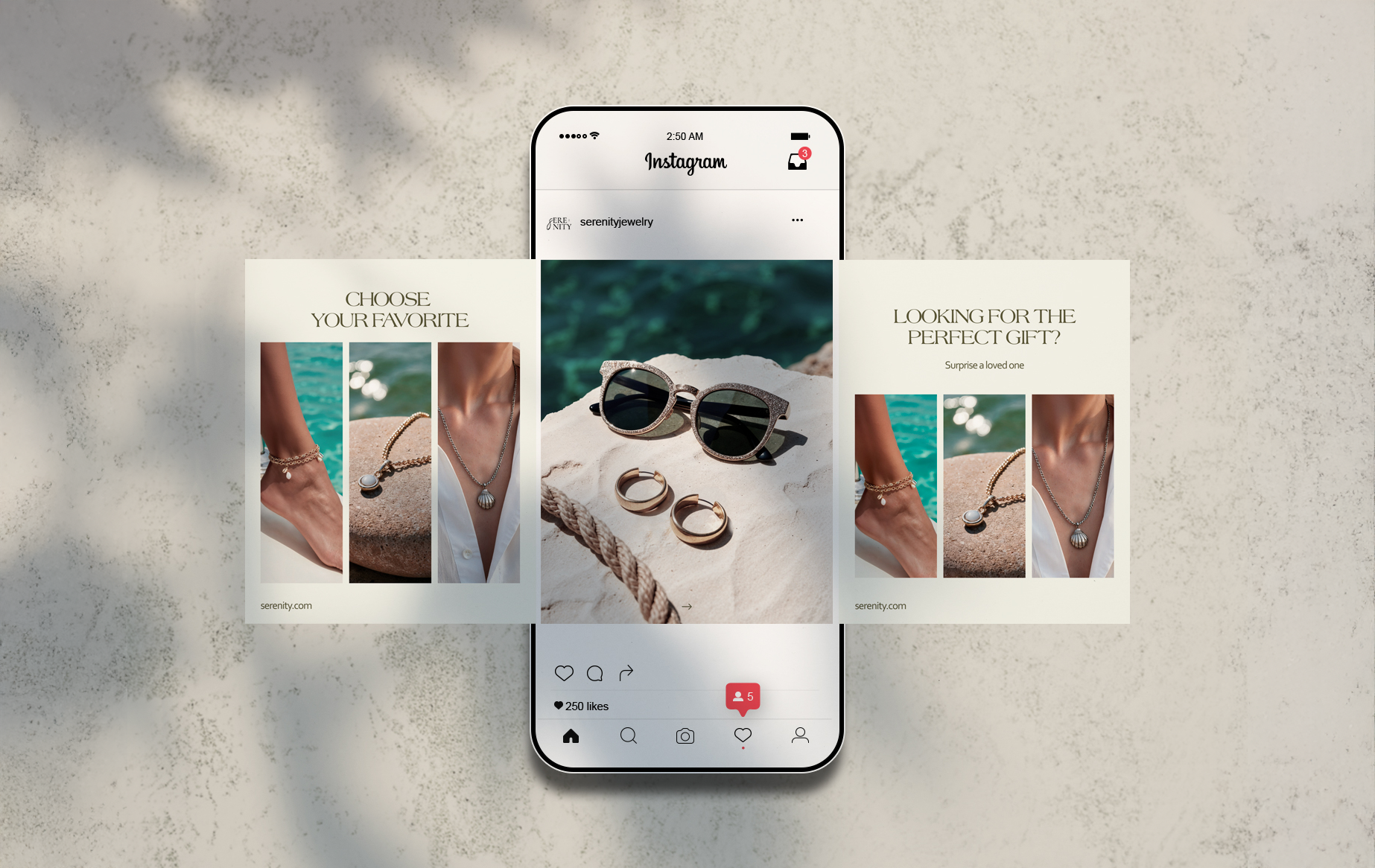
Advertising
The advertising assets were designed as an extension of the brand system. The billboard was designed for high-impact visibility. Strong imagery, minimal copy, and clear branding were prioritized to make the message readable and recognizable within seconds. Together, these assets work as a system: one attracts, the other builds relationship.